
Michel Eugène Chevreul was a 19th century chemist responsible for many scientific breakthroughs in medicine, but also in art, the latter of which leading the way for two new styles of art to emerge, Impressionism and Neo-Impressionism.
Chevreul’s interest in colour theory began when he became the director of the Gobelins tapestry works, his role in which was to take charge of the quality of the dyes used. There was some criticism as to the appearance of certain colours when used with others, which Chevreul considered to be a visual phenomenon, as opposed to a physical problem, and eventually deemed it to be ‘simultaneous contrast’, meaning colours would tend to appear closer to their complementary colour in both hue and darkness when placed against certain other colours.
In 1660, Isaac Newton discovered that all of the colours of the spectrum could be found within light, which led the way for Chevreul’s future discovery regarding colour.
In 1839, Chevreul published a book of his findings called ‘De la Loi du Contraste Simultané des Couleurs‘ which was later translated into English as ‘The Principles of Harmony and Contrast of Colours‘ in 1854 in which he considered all the colours visible in the spectrum and how they interact with each other, whether it be in a harmonious or incongruous way.
Chevreul discovered that the tones of two different colours are seen differently when viewed in juxtaposition and on different coloured grounds, appearing darker or lighter as a result.

Chevreul’s Law
Chevreul considered that the human brain has a tendency to see what it wants to see; in this case, that means the brain will intensify colours to be able to ‘see’ them clearer. Darker tones become darker and lighter tones become lighter. This would explain why I was able to see two different shades of (neutral) grey when placed next to either the black or the white in exercise one of this project. When two hues are juxtaposed, the human brain will add a little of the complementary colour to each hue of the one it is juxtaposed to, to be able to view each of the two hues as differently as possible.
Later in Chevreul’s career, he was faced with trying to resolve a problem between an industrialist and a wallpaper manufacturer. The industrialist had ordered green wallpaper with a grey pattern. When the industrialist came to collect the wallpaper, he refused to pay as the grey appeared to have a red hue. Chevreul was asked to work out whether the grey was actually holding any red hue, but he concurred that both the industrialist and the manufacturer were right. The grey was, in essence, ‘pure’, but the green background had caused the human brain to apply the green’s complimentary red hue to the grey.
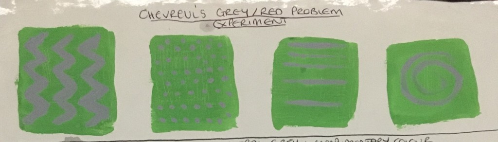
I decided to carry out Chevreul’s dilemma with the green wallpaper as an experiment within different thicknesses and shapes of lines and dots. Whilst the photograph isn’t the best, in real life, I can genuinely see the red hue in the grey. I find this astonishing and something which I feel you have to actually carry out to be able to fully believe your eyes / brain! This could be very useful in creating interesting pieces in the future.
Colour Juxtaposition Combinations
Chevreul realised there were different juxtaposition combinations and effects of the same, explained as simply as possible below:
- Black – When placed in juxtaposition to any colour, the black will absorb that colour’s complimentary hue, for example, when placed next to red, the black will take on a green hue.
- Complimentary – Two complimentary colours in juxtaposition: One colour will take on the complimentary hue of the other, intensifying the hue of the actual colour itself, and vice versa. An example of this would be if yellow and violet were placed in juxtaposition. The complimentary colour of yellow is violet, so this would be added to the already violet colour and would simply intensify the same, enhancing the vibrancy of the colour seen. This would also be the same in reverse. This is what ‘simultaneous colours’ refers to.
Artists’ Use of Chevreul’s Theories
Impressionism
Together with Eugene Delacroix, a French painter, Chevreul became a major influence to the development of the Impressionist movement. Impressionist artists were less concerned with recreating an accurate representation of the real world, but more so working ‘on the spot’. Artists began stepping outside of their studios and working realistically as opposed to what was deemed the ideal.
This movement was developed by Claude Monet and other French artists in the 19th Century. As a result of working outside, artists became more aware of the effects of natural light, colour and changing patterns of the the same throughout the day and seasons of the year. Due to how quickly the artists now worked, the brushstrokes were no longer ‘invisible’, but were now more broken and rushed to show the change in the light and its constant change.
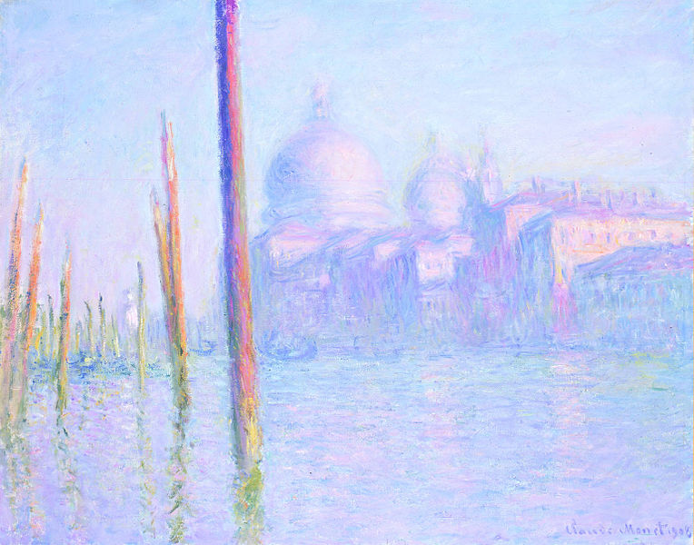
Fig.2. Monet, C Grand Canal (1908) 
Fig.3. Monet, C Grand Canal, Venice The Grand Canal (1908) 
Fig.4. Monet, C Canale Grande and Santa Maria della Salute (1908)
Monet painted six pieces from the same position in Venice, looking out across the Grand Canal, towards the Salute church. This view had been studied numerous times before by other artists, however, Monet decided to take a different approach and painted the same view during different times of the day and also throughout the three months he was in Venice.
I wasn’t quite sure which of these paintings came first; just because the light in the three paintings I decided upon appears to shift from morning, noon to night of one single day, I figured the ‘night’ could have been from an October night, whereas the ‘morning’ piece could actually be from a December morning. Regardless, I decided to look at the paintings as three from a hypothetical single day, as discussed above, to make it easier to see the shifting of colours.
Looking at the three pieces side by side, it is instantly apparent how the application of the paint begins very vibrantly, light in tones, but also barely distinguishable. Monet suffered from cataracts in his later days and advised how he saw the world very differently as a result. The haze which appears to cover the image in the ‘morning’ piece and the lack of clarity and definition to the buildings etc very much represent his struggle with the illness.
As the day progresses, the tones darken and the definition becomes more apparent. All of the pieces have a large blue presence, but the earlier pieces hold a much lighter hue as well as a large presence of pink. As the day progresses, the pinker hue develops to that of a deep purple. There is also a presence of green which begins as a very light and vibrant hue, and progresses towards a darker, murkier hue. The fractured appearance of the water becomes much more intensified with the darkening hues and reminds me of van Gogh’s moodier works, leading me to think perhaps Monet also had a darker side to his personality himself? Finally, it is very apparent that there is absolutely no black to the piece. All shadows are created by the darker hues and tones in sharp contrast with the lighter ones. Considering Monet’s preferred colour for these pieces was blue, which is actually considered to be quite a ‘cold’ colour, the inclusion of the other complimentary colours really help to bring a warmth to the pieces.
I actually really enjoy this method of working and could see myself working in a similar way, but feel I now have a better understanding of how I would create such an effect and the methods in which to achieve it, having a clearer – if not expert – understanding of the colour wheel and Chevreul’s theory.
Neo-Impressionism
After the beautiful pieces created by Monet and his fellow Impressionists, several artists began looking for new methods of painting which had not been seen before. These artists became mostly focussed on landscapes, townscapes and seashores. Science had become quite a large part of the art world, thanks to the works of Newton and Chevreul previously, and artists began considering the effects lines and colours could have in their work and how juxtaposition could be used to create more intense colours than would have been created by mixing the two colours instead.
One artist from this era was Georges Seurat, whose work consisted of many organised dots of pure pigmentation in juxtaposition to their complimentary colours to create the optical illusion of depth, tone and intensity of hues. Seurat felt that painters could use colour to harmonize pieces, but to also include an emotional element as well. He considered that ‘happy’ emotions could be perceived in brighter, luminous and warm colours, but also by using lines which were directed upwards within the piece. In contrast, he felt that ‘sadder’ emotions could be invoked by downward facing lines and darker, colder colours.

The above piece is extremely fascinating as when you see it from afar, the subjects within do appear to be ‘solid’ objects, whereas when viewed close up, they simply disperse into just the many different dots. It strikes me that this could also be said for we in the real world in that generally we are seen as solid entities, however, when viewed under a microscope, you see the tiny atoms and molecules which, in essence, hold us together and give us that form, depth and tone.
Whilst this method of working does not really appeal to me due to its requirement for a lot of self-control and patience, whereas I enjoy being much freer in my work, I can fully appreciate just how magnificent the skill and effort put into creating it actually is. I admit that I have seen this piece many times before, but have never understood the reasoning behind what I considered to be just a random and bizarre way of working until now.
Post-Impressionism
Post-Impressionism occurred from around 1886 when the Impressionist movement saw its last group show in Paris as artists began to move away from the Impressionists’ view that light should be recreated realistically and began using more vibrant and vivid colours to create their pieces, as well as distorting form and geometry, pushing the world of art further away from the ‘ideal’ created by the Old Masters.
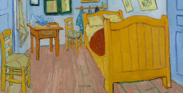
Whilst I have researched this piece previously, as can be seen by clicking here, I now feel I have an even deeper understanding as to the reasoning for the outline colouring I had previously felt rather perculiar and the choice of the blues, yellows, greens and oranges. It is bizarre to me that the first thing I notice now upon looking at the piece is the strong contrast between the green and the pink hue. Before, I thought this to be quite a strange choice, but now I can see how this has actually been done on purpose to intensify the colours due to them being rather complimentary to each other!
Abstract Art
Abstract art came to the forefront in the early 1900s when artists began to represent the world they saw in a very different way. Certain artists were no longer interested in representing real life objects such as the landscape or the human figure, but became more interested in simplifying these things down or honing in to show the geometrical shapes, colours, gestural marks and the light reflected.
Robert Delauney, a French artist of the 20th Century, founded a movement called ‘Orphism’, in which strong colours and geometric shapes were the main focus – the basis on which abstract art would build upon. Delaunay was very interested in experimenting with depth and tone, as well as theories relating to colour.

Before undertaking this exercise, I had seen many pieces such as Delaunay’s, however, I had never appreciated them before. What I had previously considered to be random placements of colour on a canvas. Now, I am rather taken aback by the colours used and the way they have been placed next to each other, having hidden messages within. I really like the way there are very warm colours placed next to rather cold colours, the contrast of light and dark tones within the piece in a very fractured way. Whilst not something I have ever considered doing myself due to not feeling as though I fully understand the concept, I think I now have a better understanding of it and would like to experiment with in my semi-abstract pieces or further.
Experiments
After carrying out the research, I decided to undertake some quick experiments of my own to try to understand the different things artists had discovered about colour and the mind’s interpretation of the same.
Neutral Grey and Complimentary Colour Combination
I began by creating six patches of neutral grey on a palette and adding a little of each colour to each patch. I then painted squares with the grey patches and wrote the colour I had added to them above the patches. Once this had dried, I then added a spot of the complimentary colour on top of the grey colour.

Once these patches and spots had dried, I took a look over each one and was surprised to see that, whilst I had actually only added the tiniest amount of base colour to the grey, the colour is actually very easy to see when the spot is placed in the centre. The first patch (yellow / violet) is very strong, as are the third (blue / orange) and the last (orange / blue). This is fascinating. Utterly fascinating. The way in which a simple grey can be manipulated so easily with surrounding colour is mesmerizing.
Neutral Grey and Own Colour
After I carried out the above experiment, I wondered what would happen if I were to add a touch of a colour with a spot of that colour on top as opposed to the complimentary colour.
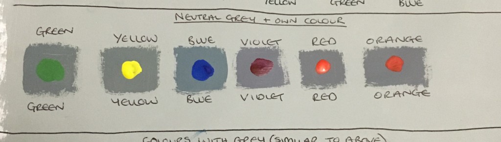
This was mesmerizing again in a completely different way – instead of seeing the complimentary colours, I could now see each own colour in the base and the spots were much more vibrant in their intensity!
Colours with Grey (in Same Method as Green Experiment)
Finally, I decided to carry out an experiment in the same manner as the green and grey wallpaper dilemma previously experimented with to see whether I could see the complimentary colours in these as well.
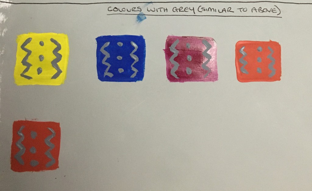
I can definitely see a bluer hue in the yellow patch, but admit I cannot really see any other colours. Perhaps this is due to the thickness of lines, size of the patches, I’m not sure. Perhaps it is only apparent when the grey is the ‘darker’ hue? I can definitely see that the grey appears much darker on the yellow than it does on the blue? This is something I will think on and consider further during my progression through my course.
List of Illustrations
Fig.1. Chevreul, M (1861) ‘Presentation of a Way to Define and Name the Colours’ [Unknown] At: https://commons.wikimedia.org/wiki/File:Cercle_chromatique_Chevreul_3.jpg (Accessed on 17 February 2020)
Fig. 2. Monet, C (1908) ‘Canale Grande and Santa Maria della Salute’ [Oil on canvas] At: https://en.wikipedia.org/wiki/Le_Grand_Canal (Accessed on 11 March 2020)
Fig.3. Monet, C (1908) ‘Grand Canal, Venice The Grand Canal’ [Oil on canvas] At: https://commons.wikimedia.org/wiki/File:Claude_Monet,_Le_Grand_Canal.jpg (Accessed on 12 March 2020)
Fig.4. Monet, C (1908) ‘Grand Canal’ [Oil on canvas] At: https://commons.wikimedia.org/wiki/File:Monet_Grand_Canal_Legion_of_Honor.jpg (Accessed on 12 March 2020)
Fig.5. Seurat, G (1884) ‘A Sunday on La Grande Jatte’ [oil on canvas] At: https://www.artic.edu/artworks/27992/a-sunday-on-la-grande-jatte-1884 (Accessed on 2020)
Fig.6. van Gogh, V (1888) The Bedroom [oil on canvas] At: https://www.vangoghmuseum.nl/en/collection/s0047V1962?v=1 (Accessed on 18 March 2019)
Fig.7. Delaunay, R (1912) ‘Windows Open Simultaneously (First Part, Third Motif’ [Unknown] At: https://www.tate.org.uk/art/art-terms/s/simultanism (Accessed on 2020)
Bibliography
Britannica. (2019) ‘Michel-Eugène Chevreul – French Chemist’ [online] At: https://www.britannica.com/biography/Michel-Eugene-Chevreul (Accessed on 4 February 2020)
Intermonet. (2006) ‘The Colors of Monet’ [Online] At: http://www.intermonet.com/colors/ (Accessed on 11 March 2020)
MOMA. (Unknown) ‘Robert Delauney’ [Online] At: https://www.moma.org/collection/works/78302 (Accessed on 16 March 2020)
Tate. (Unknown) ‘Impressionism’ [Online] At: https://www.tate.org.uk/art/art-terms/i/impressionism (Accessed on 4 February 2020)
Tate. (Unknown) ‘Simultanism’ [Online] At: https://www.tate.org.uk/art/art-terms/s/simultanism (Accessed on 4 February 2020)
The Colour Group, Academia. (2011) ‘Chevreul’s Colour Theory and its Consequences for Artists’ [Online] At: https://www.academia.edu/5633790/Chevreul_s_Colour_Theory_and_its_Consequences_for_Artists (Accessed on 9 March 2020)
Van Gogh Museum (Unknown) ‘The Bedroom’ In: van Gogh Museum [online] At: https://www.vangoghmuseum.nl/en/collection/s0047V1962?v=1 (Accessed on 18 March 2019)
WikiArt. (Unknown) ‘Rythm, Robert Delaunay’ [Online] At: https://www.wikiart.org/en/robert-delaunay/rythm-1 (Accessed on 16 March 2020)
Wikipedia. (Unknown) ‘Abstract Art’ [Online] At: https://www.tate.org.uk/art/art-terms/a/abstract-art (Accessed on 16 March 2020)
Wikipedia. (2020) ‘Georges Seurat’ [Online] At: https://en.wikipedia.org/wiki/Georges_Seurat (Accessed on 16 March 2020)
Wikipedia. (2019) ‘Le Grand Canal’ [Online] At: https://en.wikipedia.org/wiki/Le_Grand_Canal (Accessed on 11 March 2020)
Wikipedia. (2020) ‘Michel Eugène Chevreul’ [Online] At: https://en.wikipedia.org/wiki/Michel_Eug%C3%A8ne_Chevreul (Accessed on 9 March 2020)
Wikipedia. (2020) ‘Neo-Impressionism’ [Online] At: https://en.wikipedia.org/wiki/Neo-Impressionism (Accessed on 16 March 2020)
Wikipedia. (2020) ‘Post-Impressionism’ [Online] At: https://en.wikipedia.org/wiki/Post-Impressionism (Accessed on 16 March 2020)

3 thoughts on “Research Point 2.1.0: Chevreul’s Colour Theories”