

Research Point 2.2.0 : Still Life and Flowers by 17th Century Dutch Artists / Still Life by 18th, 19th and 20th Century Artists
The results of my findings for this Research Point can be found by clicking here.
Exercise One: Drawing in Paint
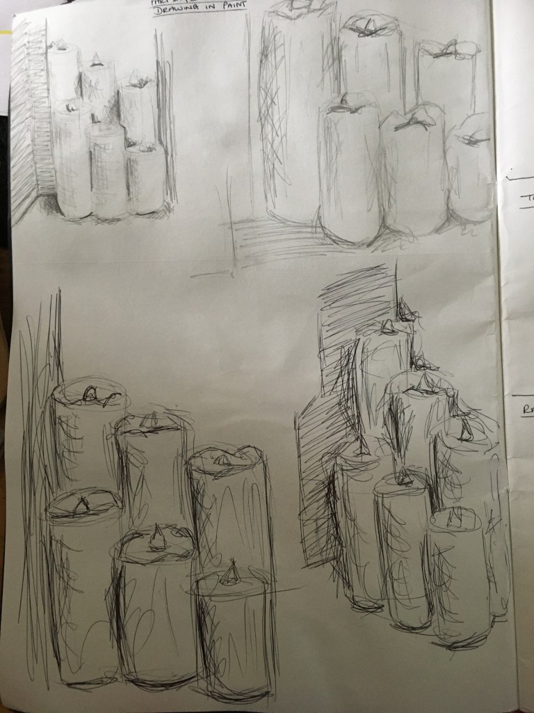
I began this exercise by carrying out some simple drawings of an area of my house I had worked on previously, due to being drawn to the shapes and just the actual composition in particular. I settled on the fourth (bottom right) sketch due to the interesting lines, direction and placement of the objects. Whilst the exercise advised I could apply colour, I decided to refrain from doing so to continue working in a monochrome way for a while and so as to assist me with seeing the process and results clearer.
Because this exercise was to experiment with drawing in paint, I decided to firstly draw in an acrylic marker I had so as to be able to compare between that and paint with an actual paintbrush. I found this method quick and easily controlled, very much like drawing with a felt tip pen. If I squeezed the pen more, more paint would flow through, meaning a thicker application and darker patch. If I eased off the pressure, the paint would dry up and the the lines would become fainter, broken and lighter.

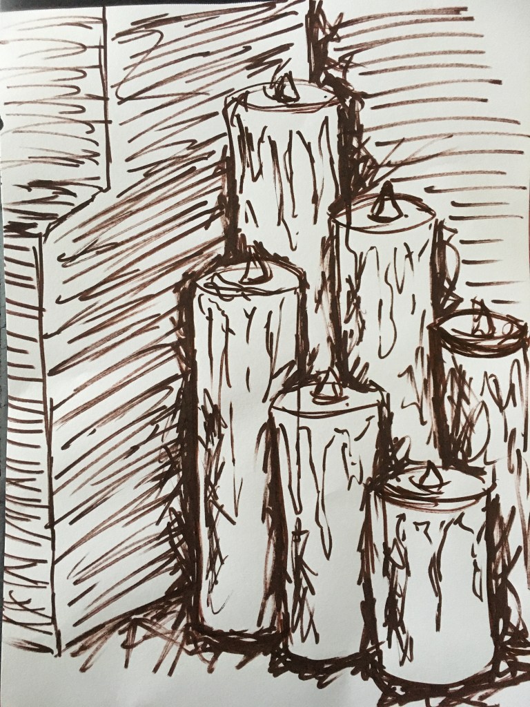
Finally, I created a line drawing using just a paintbrush and some diluted brown paint. I began with a faint line and slowly built this up layer by layer to create some tonal areas. I admit I found the handling of the brush with such fluid colour rather difficult due to my tremor taking hold somewhat, however, the layering helped to hide this to some extent. I’m not actually bothered about my tremor showing through and think it actually adds a little something – character maybe? – to my pieces as it is my unique ‘fingerprint’ so to speak. However, drawing from a standing position with my arm outstretched causes a little stress on the muscles in my arm, which I worry may tire me out too soon and leave me unable to finish a piece in one sitting. I think the use of a mahl stick will really assist with this issue, as well as when trying to focus on finer details.
Regardless, I actually prefer this method of drawing in preparation of a painting. I do think I need to stick to very pale shades depending on what my colour scheme will be so as to disappear if behind a lighter shade. However, if the under-drawing is actually to stand out, perhaps darker shades will work quite well also to achieve the opposite effect.
Exercise Two: Still Life with Flowers
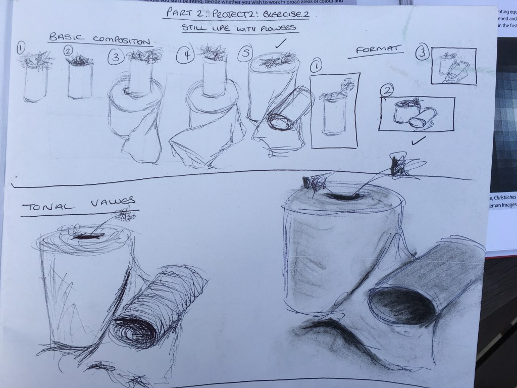
Again for this exercise, I carried out some studies within my sketchbook first as instructed in my course manual before moving on to the final piece. As this exercise asked for a still life with flowers, I decided to have a play with my subject matter and to choose something current (with regards to the COVID-19 lockdown) and to add a touch of humour to the piece. I figured the use of a full toilet roll, an empty toilet roll and a dandelion (referred to by children as ‘wee the beds’, but also known as ‘weeds’) to be quite comical and something which would remind people of the panic-buying which occurred during this uncertain time.

I decided I wanted to try to emulate Morandi’s style again for this piece, but much more successfully, hopefully! I also tried to consider the works of Agnes Martin (as directed by my tutor) to attempt creating a piece which had quite a strong contrast in the hole of the empty toilet roll (the black hole becoming the main focus since we are currently in unknown times and you do not know what to expect in a blackhole, but it still draws you in) against a very muted scene.
I was actually rather pleased with the result, but do not think I was too successful in getting my lightest colours to be as light as possible – the fold in the tissue, for example, has a darker outline which I was unable to blend enough as I had applied the line too thickly. The reason for this thicker line was due to having mixed a colour and believing it to be barely beyond white. When I applied it, I was really surprised to see that it was actually rather dark, however, I could not get it to lift and decided to leave it so as not to overwork it, and to simply bear it in mind moving forward. I admit I am extremely intrigued by this ‘lightest light’ concept!
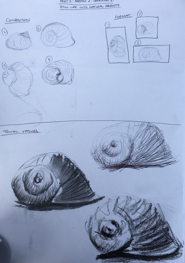
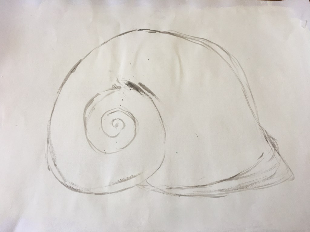
Exercise Three: Still Life with Natural Objects
Sketchbook Studies 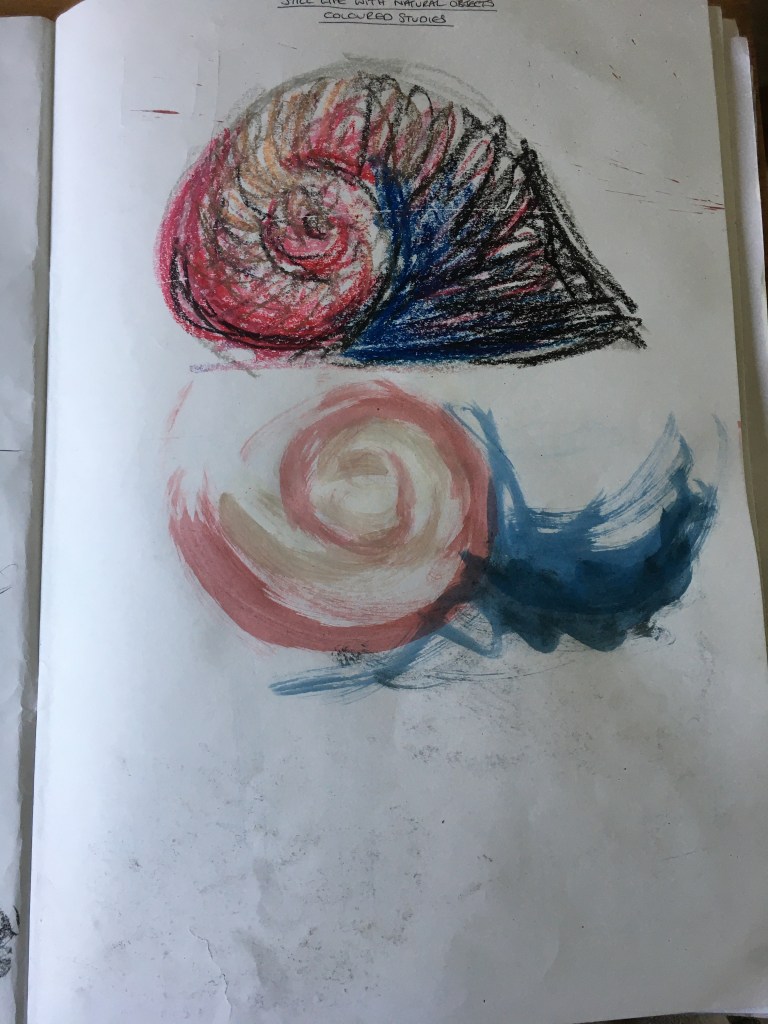
Sketchbook Studies
For this exercise, I was to look at natural objects. Due to being in lock-down, I was rather limited in finding subject matter. I went outside with the intention of finding a few different coloured stones to work from, when I came across an empty snail shell which had some lovely contrasting colours but in a very muted way.
As before, I began by carrying out some initial studies in my sketchbook as instructed in my manual.
Stage 1 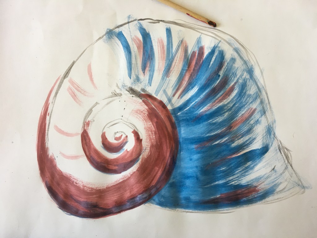
Stage 2 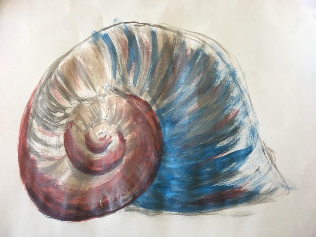
Stage 3 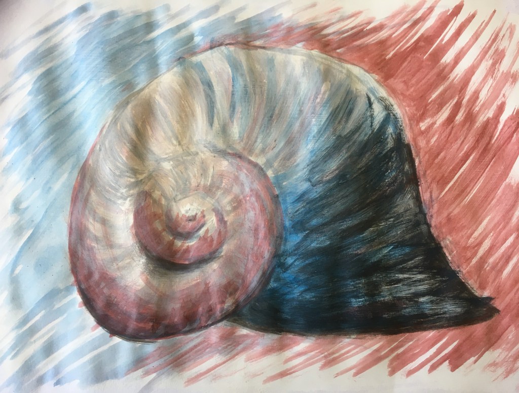
Stage 4
After carrying out some experiments within my sketchbook, I began painting my piece. I began with a drawing in a grey colour to lay out the measurements and placement of the object. I then slowly added colour, working lighter and lighter.
I tried to replicate the shell’s chalky surface within my painting but think I have only succeeded in overdoing the white layering and giving the shell too much of a washed out effect. I tried to add a little colour back in the darkest tonal areas, but decided to stop to avoid over-working it further.
Looking back, I think perhaps I should have followed in a similar way to my previous exercise and only used a very light ‘dark’ hue to begin with instead of trying to lift it so much. I think I should try to create a ‘scale’, such as in music for example, to work within as opposed to trying to use the full keyboard.
Exercise Four: Still Life with Man-Made Objects

1 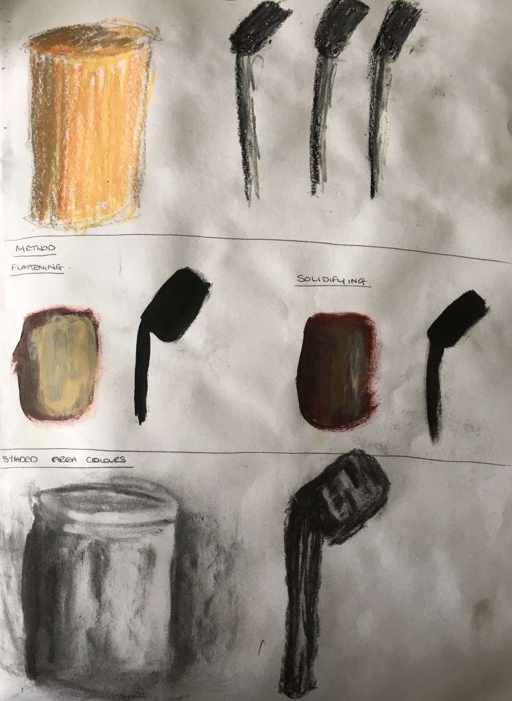
2
For this exercise, I wanted to attempt to recreate very different surfaces and textures. Whilt not the most utterly interesting of subject matters, I settled on a set of knives from my kitchen, the base of which was wooden and the stems of the knives metal. The wood was rather flat and solid in its appearance, with an almost rough texture. The knives were completely opposite; the light was rather fractured and showed more as patterns than solid colours. I thought these would be rather interesting to try and recreate and rather contrasting against each other.
3 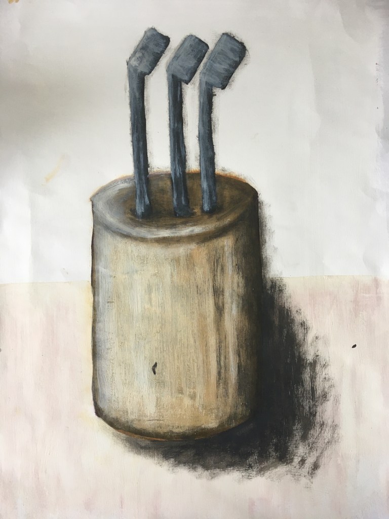
4
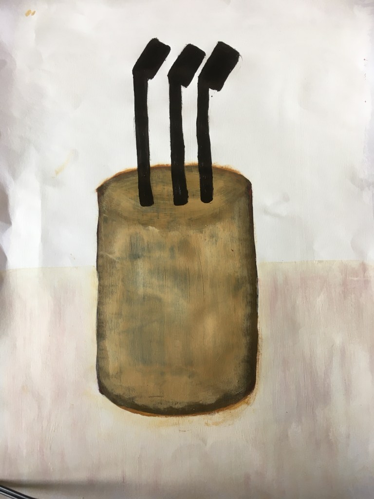
I decided that, once again, I wanted to attempt to create something with a touch of Morandi’s style in there amongst others due to my new-found appreciation for light and subtle colours. However, I still wanted to include a quite a dramatic contrast within the piece, just as in the works of Borremans and Tinei, as recommended by my tutor in his feedback.
I began my final piece by creating a very pale pinkish marble-effect background for the lower surface, but leaving the upper surface the colour of the primed surface (matt white emulsion). I then painted a dark brown colour for the wooden holder’s base and black for the base colour of the stems of the knives. I then built this up by lightening my colours slowly but surely, having decided I wanted to work slightly more flat than solid, just as Morandi would. I continued in this manner until I felt I had reached a natural end to the piece.
Upon reflection, I really like the messiness of the piece and think that , overall, I have been successful in making an interesting, rather believable piece of work. I do wish, however, that I would listen to my inner self more as I think the piece would have been just as successful without the addition of shadows (or perhaps of a much gentler shade) and still feel I can be my own worst enemy at times! Regardless, I do connect to the piece myself and am drawn to this contrast, so perhaps it should be something I try to work with better as opposed to trying to override? I do also think that my shadow placement has not been fully successful as it looks a little too sparse down towards the lower right-hand corner of the holder, needing more of a curve inwards to the shadows to make them rather more believable. I think the overall perspective and angles are also rather disjointed, so this is something I will need to pay better attention to. This is all very much food for thought though and I do think this exercise has been rather eye-opening in some ways!
