
Overall Comments
Again, I was very pleased to read my tutor’s feedback on my second assignment. Reading his overall comments, I fully agree with his comments regarding being too concerned with the final assignment piece as opposed to the carefree nature I apply to the exercises and allowing myself to be much more balanced in my approach. Below are the things I am going to take away from this piece of feedback and which I will refer to when coming to part five.
Strengths
- A rather surreal, dreamy quality to my final assignment piece with an exotic ambiguity.
- Good overall use of initial tone and colour, and colour mixing choices are tastefully sensitive and subdued.
- The ‘light source, highlights and shadows’ and ‘relationships between objects and background’ exercises would be good starting points for final piece.
- Sensitive use of colour in reflection of the vase.
- Exercise three has freedom and boldness within it.
- Monochromatic tonal studies are strong.
- Limited palette assists in constructing my images.
- Composition is minimal and effective with good visual skills and creativity.
- Exercises three and four hold a successful balance of opaque and transparent painting.
- Reflection is strong and applied to mood exercise as well as experimentation.
- Critical thinking is good and reflect well.
Areas for Improvement
- Use of more peculiar objects which would not necessarily be found within the household to create more interesting compositions.
- Add more definition between the lighter colours in the piece by using strong contrasting colours and tone to create depth.
- Combine transparent and opaque paints to also assist with depth and balance.
- With regards to the reflected colours in the vase of my final assignment piece, I should try to add more extremes to contrast light and dark.
- Build paintings over several days where needed and not rush through them so layers can dry.
- Use elements of exercises in final submissions.
- Use more limited colours and a pared down palette.
- Include more freedom and less inhibition within final pieces.
- Don’t leave white areas unattended in the background as it appears unfinished. Use a very subtle colour instead.
- Need to work on strengthening both tone and colour within pieces and not just one or the other.
- Look more closely at contemporary painters’ techniques compared to classical methods.
- Create under-paintings first to consider tonal qualities.
Suggested Reading
Georgia O’Keefe – Use of Paint, Colour and Form in Floral Paintings
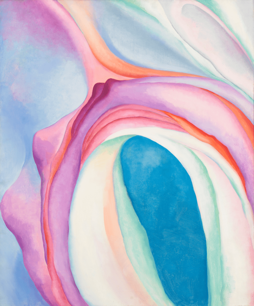
Fig. 1. O’keefe, G. (1918) Music, Pink and Blue, No. 2 
Fig. 2. O’keefe, G. Lake George Reflection (c.1921-1922) 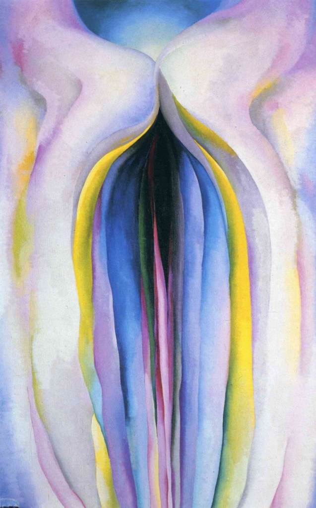
Fig. 3. O’keefe, G. Grey Lines with Black, Blue and Yellow (1923) 
Fig. 4. O’keefe, G. Black Iris (1926)
I have made no secret of my appreciation of the work created by Georgia O’Keefe and so I am pleased my tutor has recommended her work. I think now is the time to perhaps experiment with watercolours as I have noticed that my use of acrylic has sometimes been to water it down quite drastically, so I now think I should try to use actual watercolours in this way instead perhaps. I still want to work with acrylic, but I am open to trying new methods and media. I also think that by using watercolours, in which the pigment is specifically made for being watered down, perhaps this will help me achieve some quite radiant colours and tones as opposed to dull and washed out.
Suzy Babington – Use of Thicker Paint, Colour and Form
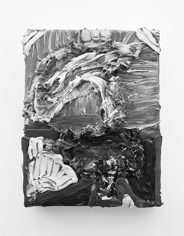
Fig. 5. Babington, S. Love Monster (2016) 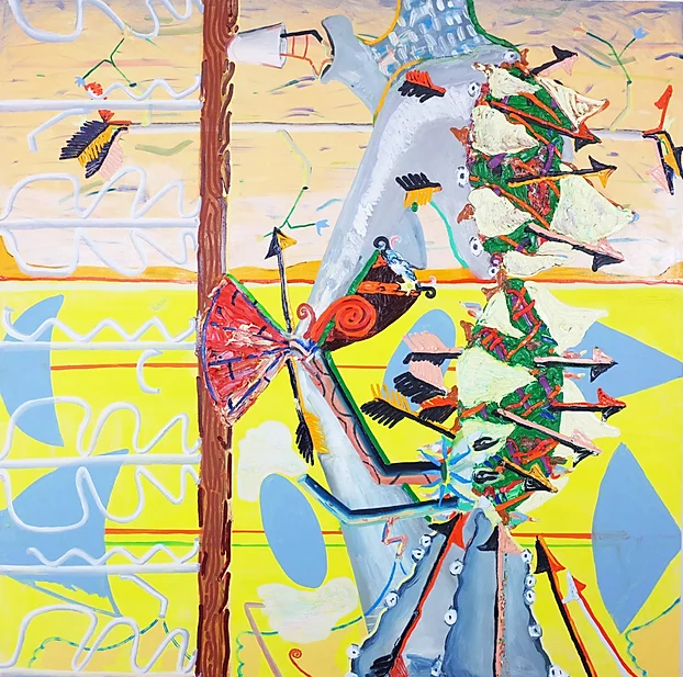
Fig. 6. Babington, S. Diver (2017) 
Fig. 7. Babington, S. Enclave (2019)
Looking at the pieces I have chosen, I am instantly drawn to the texture within Fig. 5. The piece just calls to me in such an exciting way! This is definitely something I am going to attempt down the line! I really like how dramatic the pieces are and the questions created when looking at them. I think I subconsciously reduce the amount of paint I use in an effort to be more economical due to not liking waste. This is definitely something I need to overcome and definitely something I will try to shake off during the next part of the course. Watch this space!
Mairead Oh’Eocha – Energetic Response to Still Life and Interesting Use of Colour

Fig. 8. Oh’Eocha, M. Vallayer-Coster Rose (2016) 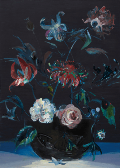
Fig. 9. Oh’Eocha, M. Plant Dressage with escaped Cobra (2016) 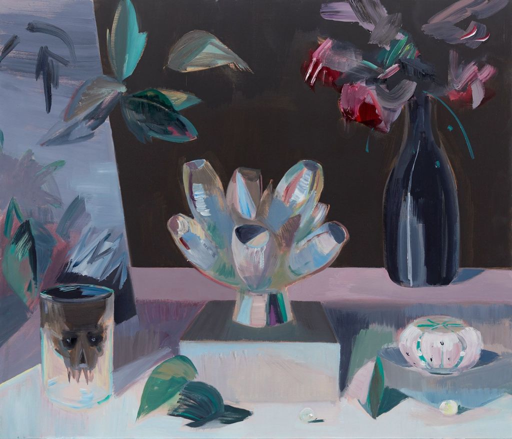
Fig. 10. Oh’Eocha, M. Irises in the Well (2018)
I really like these pieces and the dark, moody atmosphere they bring forward. I like how the backgrounds are solid colours which are bold but still rather muted colours, yet the colours within the flowers are bright and show a lot of light in total contrast. The background is calm and collected whereas the foreground objects are energetic and vibrant. I really like the contrast between the two and how the focus is clearly on the foreground. I think this could assist me going forward in the sense that perhaps I have a tendency to overwork the background and cause too much of a battle for the eye’s attention. Perhaps attempting this type of method may actually assist me with separating the grounds and is definitely something I really want to experiment with.
Elizabeth Blackadder – Consideration of Subject Matter
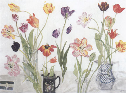
Fig. 11. Blackadder, E. Still Life with Tulips (Unknown) 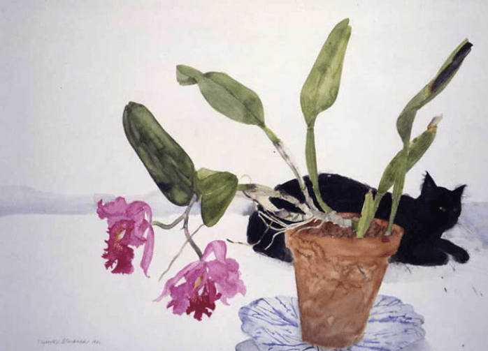
Fig. 12. Blackadder, E. Black Cat and Plant (Unknown) 
Fig. 13. Blackadder, E. Gloxinia (1931)
This artist’s work is beautiful to behold and I can really see a resemblance to Georgia O’Keefe’s work with regard to the delicate nature of the application of the paint. I can see why my tutor suggested these works to assist me with understanding the importance of subject matter as the ones chosen are very delicate in nature but then the pot offers the solid counter-balance needed. The colours of the pots and leaves is rather delicate and subtle, whereas the flowers are bold and striking, whilst still very delicate. I feel like the artist has considered the strong structure of the vase and leaves, but with a delicate application, whereas the flower is delicate in nature but bold in colour. I like this contrast and will consider this going forward.
Robert Liberace – Underpaintings and Building Pieces
Having watched this video, I can see what my tutor is trying to tell me regarding the use of under-drawings to assist with creating my pieces. This is definitely food for thought and something I haven’t really considered properly before. I have used grids and drawn general sketches, however, the use of the brown to create tonal references may actually really assist me before I commit the actual use of paint.
List of Illustrations
Fig. 1. O’keefe, G. (1918) Music, Pink and Blue, No. 2 [Oil on canvas] At: https://whitney.org/collection/works/7759 (Accessed on 25 June 2020)
Fig. 2. O’keefe, G. (c.1921-1922) Lake George Reflection [Oil on canvas] At: https://www.christies.com/lotfinder/Lot/georgia-okeeffe-1887-1986-lake-george-reflection-5994696-details.aspx (Accessed on 25 June 2020)
Fig. 3. O’keefe, G. (1923) Grey Lines with Black, Blue and Yellow [Oil painting] At:https://www.georgiaokeeffe.net/grey-line-with-black-blue-and-yellow.jsp (Accessed on 25 June 2020)
Fig. 4. O’keefe, G. (1926) Black Iris [Oil on canvas] At: https://www.metmuseum.org/art/collection/search/489813 (Accessed on 25 June 2020)
Fig. 5. Babington, S. (2016) Love Monster [Oil and acrylic on calico] At: http://www.threeworks.org/suzy-babington-info.html (Accessed on 25 June 2020)
Fig. 6. Babington, S. (2017) Diver [Acrylic and oil on calico] At: https://www.suzybabington.com/2017 (Accessed on 25 June 2020)
Fig. 7. Babington, S. (2019) Enclave [Oil and acrylic on canvas] At: https://www.suzybabington.com/ (Accessed on 25 June 2020)
Fig. 8. Oh’Eocha, M. (2016) Vallayer-Coster Rose [Oil on board] At: https://frieze.com/article/mairead-oheocha (Accessed on 25 June 2020)
Fig. 9. Oh’Eocha, M. (2016) Plant Dressage with escaped Cobra [Oil on board] At: https://frieze.com/article/mairead-oheocha (Accessed on 25 June 2020)
Fig. 10. Oh’Eocha, M. (2018) Irises in the Well [Unknown] At: https://www.artrabbit.com/events/mairead-oheocha-irises-in-the-well (Accessed on 25 June 2020)
Fig. 11. Blackadder, E. (Unknown) Still Life with Tulips [Watercolour] At: https://www.browseanddarby.co.uk/artists/blackadder-elizabeth/ (Accessed on 25 June 2020)
Fig. 12. Blackadder, E. (Unknown) Black Cat and Plant [Unknown] At: https://www.thegreatcat.org/the-cat-in-art-and-photos-2/cats-art-contemporary/elizabeth-blackadder-1931-present-british/(Accessed on 25 June 2020)
Fig. 13. Blackadder, E. (1931) Gloxinia [Unknown] At: https://www.invaluable.com/auction-lot/elizabeth-violet-blackadder-1931-gloxinia-1005-c-h5pw4gtu1j (Accessed on 25 June 2020)
Bibliography
Red Chalk, Working Large, with Robert Liberace, Excerpts from the DVD (2016) [user-generated content online] Creat. Liberace, R. At: https://www.youtube.com/watch?v=cWaLvOL7PEI&feature=emb_title (Accessed on 1 July 2020)
