
Research Point 2.1.0: Chevreul’s Colour Theories
The results of this Research Point can be viewed by clicking here.
Exercise One: Mixing Greys – Anachromatic Scale

I followed the instructions for this exercise and found it strangely satisfying to carry out. I began by applying a patch of pure white to the page, then slowly added small amounts of pure black to create a grey which darkened with every addition. I have no doubt that I could have dragged this exercise out for quite a while by adding very minute amounts of black paint and darkening the hue very gradually.
I have never actually carried out this exercise before – although I have actually mixed greys etc – and this is the first time I have been made aware of the natural grey hue. I was a little sceptical about using this as a base at first, however, looking at the information gleaned in the research point above, I found I have a much clearer understanding as to how this will actually help me see the colours precisely as they should be seen.
Exercise Two: Primary and Secondary Colour Mixing
This exercise appeared to hold several sets of instructions, so I decided to break them down into bite-size chunks, as follows:
Primary Colours
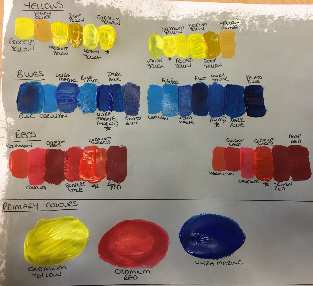
I first followed the instructions relating to the primary colours; yellow, blue and red. I laid out my different tubes of each colour and created patches of each side by side, firstly in a random order and then in a gradual order.
I was surprised to find that some of the paints were rather watery and did not apply very well in a thinner layer, meaning I had to thicken the layer. I was aware I could have used white or another hue of the same base colour to thicken the paint up, but did not want to dilute the tone any, so I just persevered and made a mental note regarding these colours for future reference. I think the watery effect some of the colours have could actually come in handy if a certain piece requires the need for a more translucent layer of paint, perhaps to be able to see the colour underneath and add another layer of interest to it.
Whilst I have seen and used all of these colours previously, it did actually surprise me that I had so many variations of just three colours! I actually enjoyed carrying this exercise out as it was nice to get to know the colours in my possession, but I could also see how this would be very useful when creating pieces in the future, to assist me in choosing the most suitable base colour.
Secondary Colours
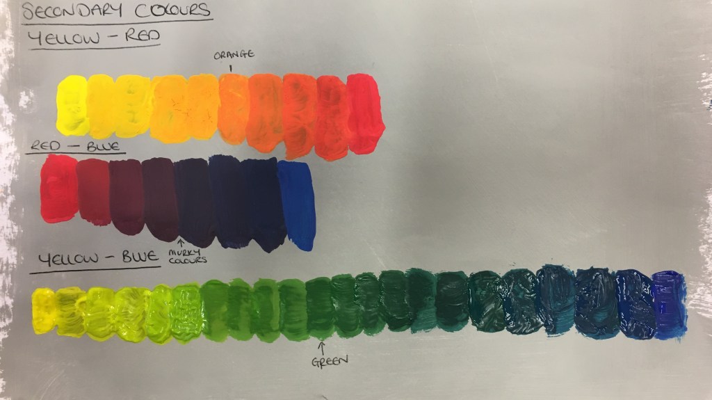
I then carried out the second part of the exercise in which I had to choose my purest colours and combine them, as shown above. I began by merging yellow and red, then red to blue and finally yellow to blue.
I was surprised to find that the red was so quick to absorb the yellow. The same was true for the blue and the red. The blue and the yellow, however, seemed to blend much more gradually.
This was rather educational for me to carry out as whilst I have, again, mixed several of these colours in the past, actually having created this step by step has really helped me to understand the colours and sequences far better. This will definitely be useful in my creation of future works.
Secondary Colour Sequences using White

Exercise Three: Broken or Tertiary Colours
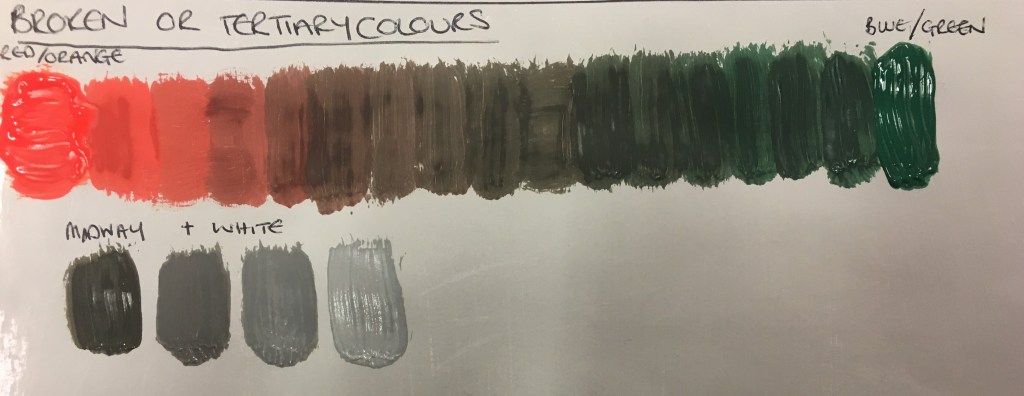
The final part of this exercise was to take two of the secondary colour sequences, use the central-most colour (the strongest secondary colour) and create another colour sequence between the two.
The central-most colours were very murky and and muddy. However, I was actually rather surprised at how they seemed to form a brown hue which had not actually been created by using a full red and green, but rather orange and green!
I then took the midway colour, as advised, and added white to it in several layers. I was extremely surprised as to how this brown hue had now changed to a rather solid grey which became lighter and light between additions of white. I was dumbfounded that these greys were almost the exact same as the greys I had created in my first exercise when mixed between black and white!
I have definitely discovered a new-found respect for colour, its capabilities and hidden secrets! This whole exercise has been extremely educational and insightful and will definitely be useful in the future. Researching the topic was useful, but actually carrying out the steps in the exercise has been very rewarding and fruitful for me.
Exercise Four: Complementary Colours
For this exercise, I decided my best plan of action would be to create a ‘mathematical equation’ by placing a patch of the lighter hue, plus the darker hue, then mixing the two together.
Once I had created this equation, I did it again but by lightening the darker hue with white. I wanted to do this to be able to see what the colour was like before the white was added for future reference.
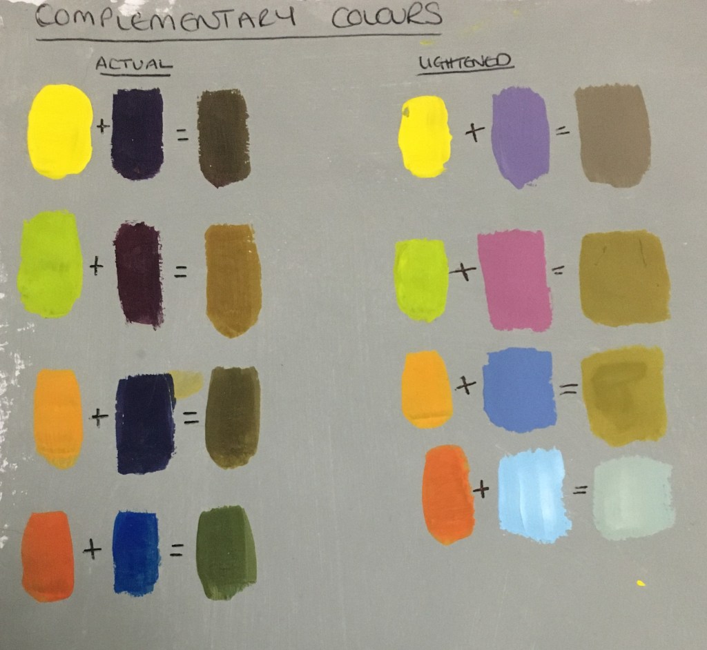
I was actually rather surprised to find that the majority of the colours created were very muddy and brown! This could actually come in very handy should I want to create different colours for such things as trees etc. I am not 100% sure that the final orange and light blue combination worked well or was completed correctly. However, I still feel it is a very muddy colour and verging on grey.
