
Exercise One: Tonally-Graded Wash
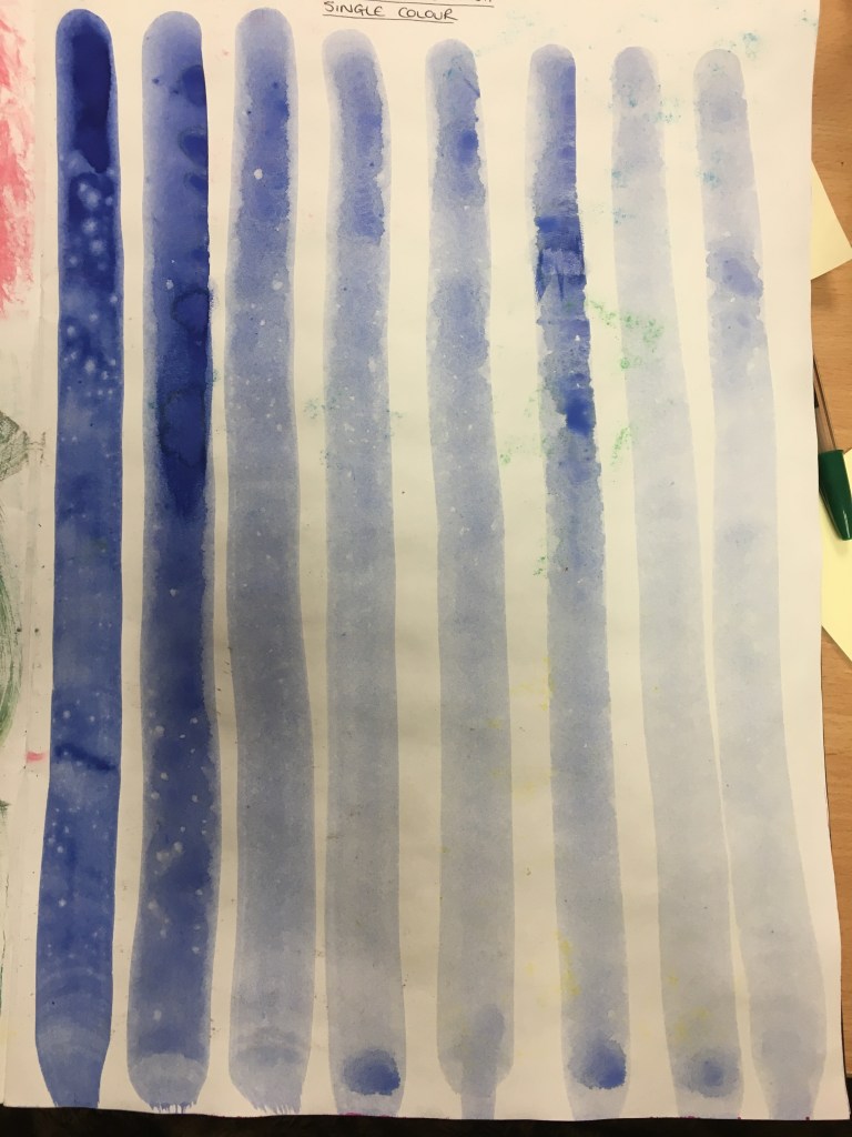
1. Single Colour Tonally-Graded Wash 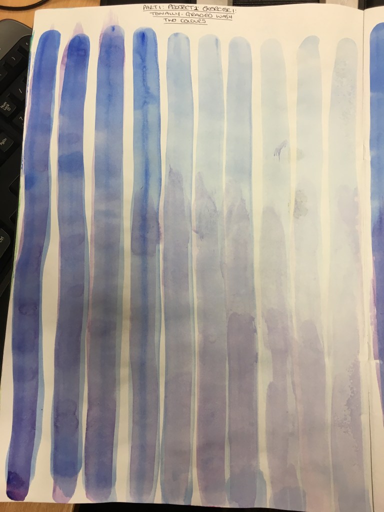
2. Two Colour Tonally-Graded Wash: Wet-on-Wet
For this exercise, I began by following the course textbook and created a single colour wash in ultramarine within my sketchbook. I then created another wash in the exact same way, but this time adding a layer of violet. I wanted the rate of dilution to be consistent and decided to use a syringe to measure out a specific amount of water each time (approximately 5ml).
I first realised that I actually really did not need a lot of paint initially as the dilution process really created a lot of leftover paint. I then realised that the more diluted the wash, the quicker the drying time. I then realised that layering the colour wet-on-wet really did fuse the two colours together to create a whole new colour completely. I did struggle with this a little as the washes did dry a little too fast for me to apply the next layer, so the blend isn’t perfect. This is something I will bear in mind if and when I use this method in the future. It is also something I wonder would happen if using watercolour since this medium is meant to be worked with wet. I also wonder whether the quality of the paper in the sketchbook would have had an impact on the saturation and thus drying of the paint.
Exercise Two: Overlaying Washes

For this exercise, I had to create the same wash and dilution experiment, however, this time I needed to leave the first layer to dry before applying the second colour. Whilst the actual results do not look altogether dissimilar in photographs, during the application process I could really see the difference. It was almost as though the page had soaked up as much as it could, so the violet wash was much more distinctive in colour over the ultramine and turned it almost invisible in parts, most notably toward the end of the dilution process. I also found this much harder to achieve a definite blend in colour, however, in the areas where I have been unsuccessful in placing the brush in the precise place as the previous colour, I really do like the layering effect which has been created as a result. Again, whilst not perfect, I feel this exercise has really taught me a lot and it is definitely something I will return to and consider moving forward.
Mark Rothko
As suggested in my course textbook, I looked into some of the works of Mark Rothko, one of which truly stood out to me as relevant to this exercise:
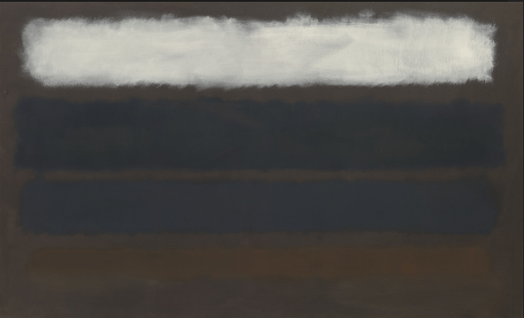
Whilst I do not specifically feel this type of work appeals to me or interests me specifically, I can appreciate the effort and quality of it.
I can see that the colours in this piece are very muted – even the white has been subdued and has areas which appear thinner and similar to the consistency of a cloud. The other three colours are so delicate, they are actually hardly visible until you look much closer. This almost makes the view feel as though they are being drawn in to the piece, such as a sponge will soak up any water within its vicinity.
I really like how you cannot seem to see where one colour ends and the background colour begins. When focussing on the yellow for too long, the colour appears to completely disappear, which I find truly fascinating!
It appears as though the white is the main colour in the piece and then the remaining three colours are almost the after-effect you have when you look at a colour and then close your eyes.
The range of hues which have been achieved in this piece to almost blend the colours into one are actually rather ingenious and I am rather drawn to the atmosphere in the piece as it feels rather dark and disturbing – the white being a ‘happiness’ and the remaining three colours drawing you down into the depression of the piece.
Exercise Three: Opaque Colour Mixing
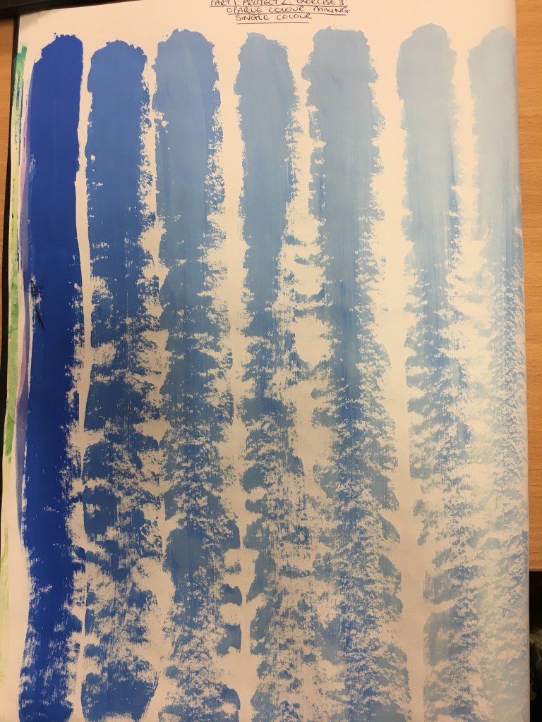
1. Opaque Colour Mixing: Single Colour with White 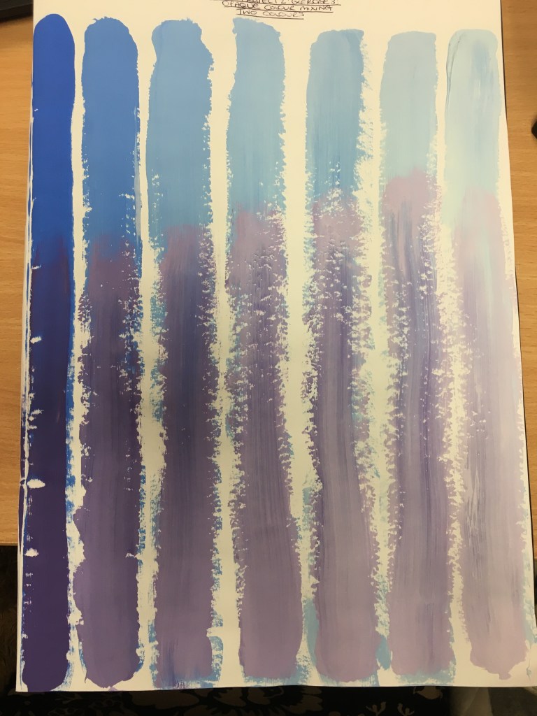
2. Opaque Colour Mixing: Two Colours with White
For this exercise, I was not to use water but, instead, use a white paint for the ‘dilution’ process. I immediately realised when creatingt he experiments that it was practically impossible to achieve the same diluted appearance as that in the first exercise with water. I noticed that the more white paint I added, the thicker and paler the colour became, meaning that the wash became more and more brittle and a solid line could not be created, whereas the water dilution left the colour still very flexible and able to manipulate at will. This technique did not allow that and I realised very quickly that this technique would be best used for smaller, shorter lines (if used in a ‘drawing’ way).
As with the dry-on-wet experiment, I found the two-colour part of this exercise to be difficult to blend when just applying one colour over the other.
Overall, I think I have created a method (using the syringe) which will allow me to create washes in the future and recreate the same results if needed, due to the accuracy available to me. This is another study which will become invaluable to me as I move forward.
Exercise Four: Monochrome Studies

Light Background and Positive Spaces 
Dark Background and Negative Spaces
For this exercise, I decided to draw two trees from memory, but in their winter months. I began by creating two base colours; one light grey (by mixing black and white acrylic) and the other a slightly diluted black to allow the colour to spread easier across the page. I found that the grey mix was much thicker and harder to spread, however, the base was much thicker and stronger to work on.
I absolutely loved creating the light background piece and think the end result is actually rather appealing. I created it by beginning with a slightly watered down black acrylic paint to allow the paint to flow easier like ink, to create the trunk and thicker branches. After that, I watered the colour down a bit more and was able to create the suggestion of the finer branches. I really enjoyed working in such a ‘flowing’ way and found the paint really wanted to flow much easier. I felt as though I was drawing as opposed to painting almost. On reflection, I think perhaps I could have used an even finer brush to create the finer twigs as well as the diluted paint.
With regard to the dark ground, I didn’t actually enjoy this quite so much. Whilst I could appreciate how this would be useful, being able to concentrate on the negative spaces, I found this exercise much harder to create in an interesting way due to my subconscious reluctance to create finer detail. I think I could definitely use this method to distinguish the larger areas of negative space created between objects, however for such things as between the finer twigs of a tree, which would require a lot more discipline on my behalf, I have found that this does not appeal to me or interest me much. I would much rather create the suggestion of such areas with the use of positive space as opposed to focussing on the negative spaces, however, I think a combination of both will be far more productive and will help me achieve a good overall picture when working with smaller, finer details.
List of Illustrations
Fig. 1. Rothko, M (1961) ‘No.14 (Horizontals, White over Darks)’ [Oil on canvas] At: https://www.moma.org/collection/works/80177?artist_id=5047&locale=en&page=1&sov_referrer=artist (Accessed on 31 January 2020)
