


Exercise One: Exploring Contrasts
For this exercise, I followed the instructions in the manual and chose a colour to begin with. I settled on a colour I already had which was pure in its container and did not require mixing, so I would not inadvertently apply parts with more pigment than another, for example, which I then created little squares with in my sketchbook. I then added several different colours from within the same section of the spectrum around the outside of the squares as well as creating another frame using the original colour, but this time mixed with white. Finally, I recreated this with green.
For the second part of this exercise, I created another set of squares using yellow this time, as well as its complimentary colour, violet. Next, I created a yellow, purple and white frame in which I put a square of neutral grey. Finally, I then created another frame around the yellow but having lightened the tone of the violet to equal that of the yellow.

For the final part of this exercise, I created a simple painting incorporating the techniques shown above. I tried to use all of the different methods and to mix them up somewhat. I did not really have an agenda with this and simply allowed the piece to develop as it would.
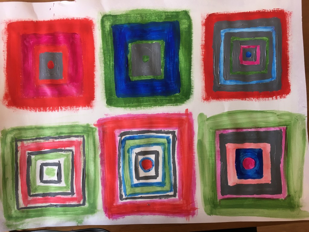
Having carried out these experiment in an earlier research point, I was already aware of the effects this process could yield, however, I still found it rather interesting and exciting to see just how influential the surrounding colours could be in manipulating the mind’s belief and reality. With regard to the colours which were close in the spectrum, it was evident that the darker the surrounding frame colour, the darker the original colour would appear and vice versa. The complimentary colours, however, simply worked to make the other colour brighter and more intense. The neutral greys appeared to have the opposite effect to the combinations made with two colours close in the spectrum, whereas the darker the outside colour, the lighter the grey appeared and vice versa. Also, It was evident that the complimentary colour was portrayed within the grey. All of this is interesting to note and I think could be rather interesting to work with in future pieces as this really does interest me. More so, I think, than exercises where I am meant to try to recreate reality.
Exercise Two: Successive Contrast
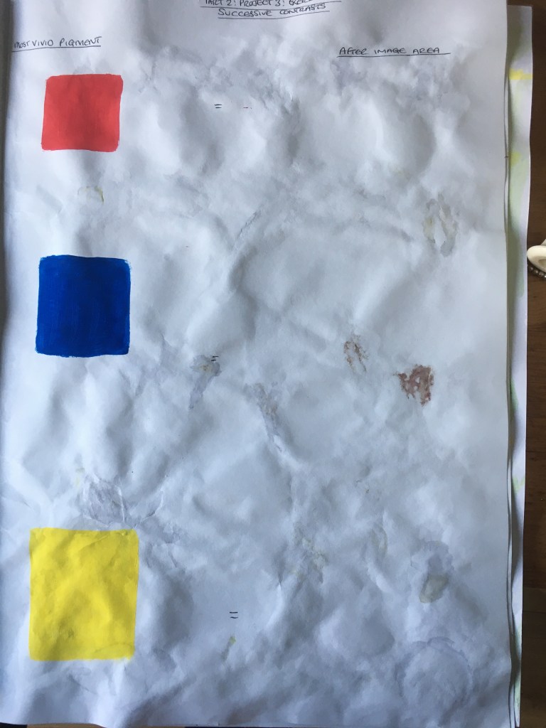
There was not much to be done within this exercise, however, I did try to look around me to try to bring the after-images to the forefront of my vision against a white wall. I also added three of the primary colours as patches in my sketchbook to see the results via paint. Unfortunately, however, I had worked on the other side of the page before I had taken a photograph of the page!
It was rather interesting to attempt, however, I did find that I could not always fully distinguish the colour I saw within the after-image and found myself wondering how this had been discovered, as well as the genius it must have took to actually realise it in the first place. I think we take it for granted nowadays, what with all knowledge at our instantly at our fingertips should we wish it, whereas when one considers that this discovery was made at a time when there was still so much unknown and ignorance. It is phenomenal!
Research Point: Optical Effects
The results of my findings for this research point can be found by clicking here.
Exercise Three: Colour Accuracy
For this exercise, I began by gathering a varied selection of leaves and petals which I saturated in PVA glue and stuck down within my sketchbook. Next, I attempted to recreate the colours of the foliage with paints, documenting the combinations as I went. I was actually rather surprised to find that the colours you would expect to realistically represent the colours of the leaves and petals was actually much brighter than the real thing. I found that the leaves required quite a muddy browny-green colour, with barely any vibrancy to them at all. The same seemed to ring true with the petals also; the yellow actually needed to be a fair bit duller and browner – the ochre yellow being perfect for this – and the reds also requiring the addition of quite a muddy brown hue apart from the rose petal which surprisingly matched perfectly with my crimson red paint. The purple petal, however, was rather vibrant and appealing, so it was quite refreshing to create this colour compared to the remainder. Even the darker purple appears duller and browner in hue.
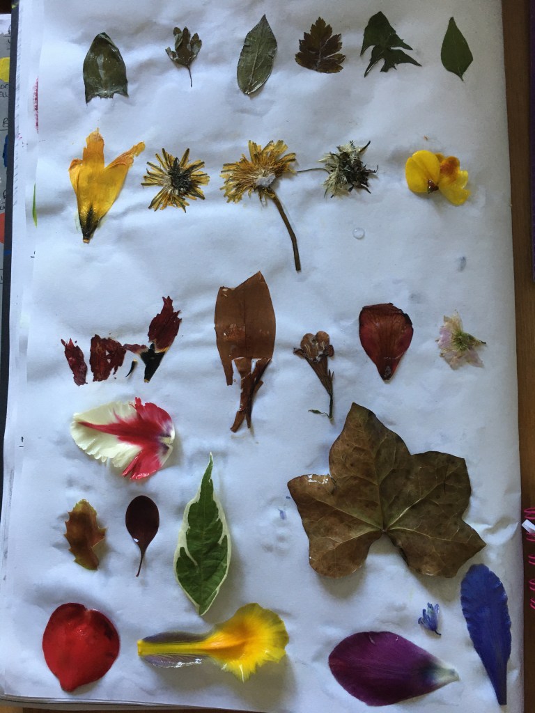
Sample petals and leaves 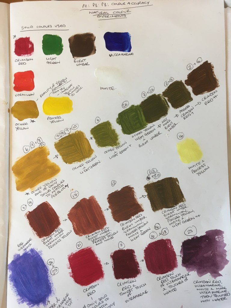
Colour experiment for petals and leaves
Having discovered a liking for the purple flowers – and the fact the yellow with them was a way of including complimentary colours, I decided to use this flower to create my final pieces for the following three exercises.
I began by creating a quick tonal study within my sketchbook so as to assist me in seeing where the strongest tonal contrasts were to be found. I then applied a thin layer of each colour’s median colours, applying both darker and lighter shades to each, as dissected within my sketchbook. I did not wish to focus too much on precision with regard to the formation of the actual flower, but simply focussed on the colours found within and attempting to recreate these as wholly as possible.
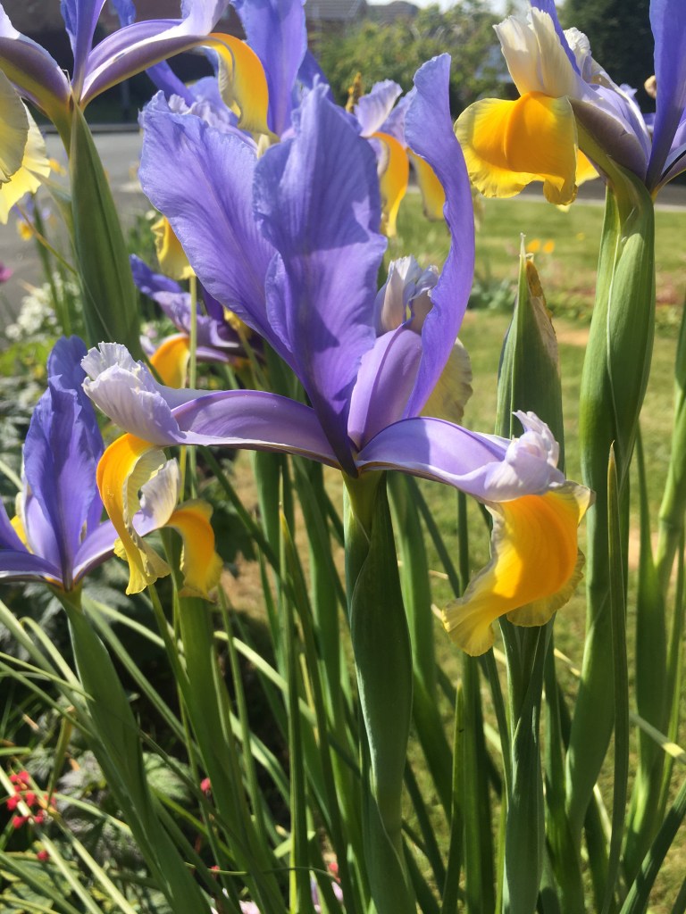
Chosen flower 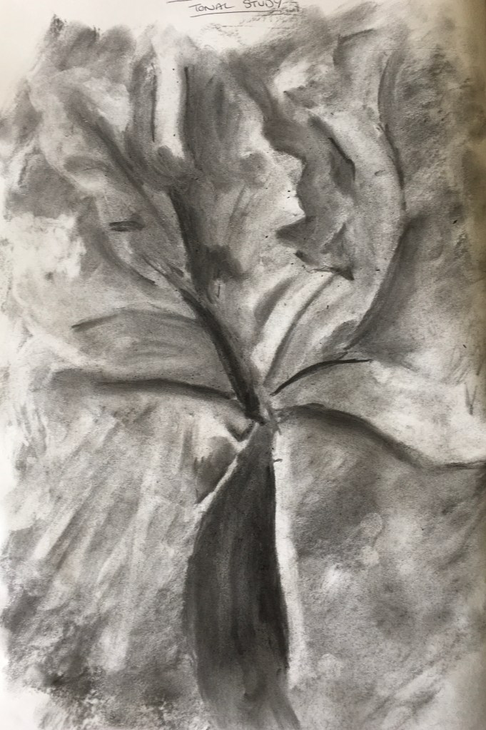
Tonal study of chosen flower 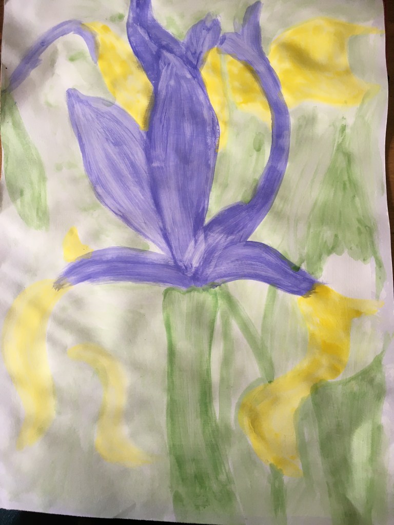
Stage 1 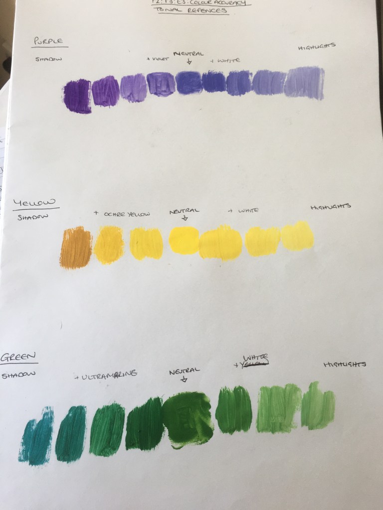
Stage 2 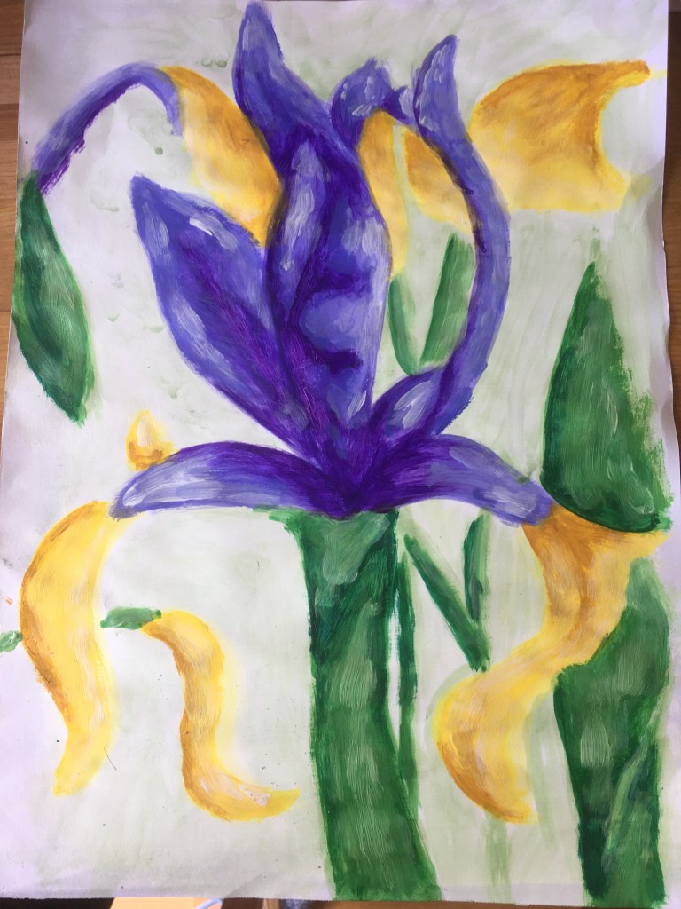
Final Piece
When looking at my final piece for this exercise, it is instantly apparent that there is a lack of precision, but this does not bother me. With regard to the colours, however, I think I have been rather successful in obtaining the appropriate hues and tonal differences within this piece. I think the end result seems somewhat fitting with the Impressionist technique and I am actually rather pleasantly surprised to find that I really like that method! I thoroughly enjoyed adding the spots of colours here and there and think I may attempt this further down the line. Whilst the aim of this exercise was to focus on recreating realistic colours, I feel I have actually discovered much more than that!
Exercise Four: Still Life with Complimentary Colours
For this exercise, I decided to use the same colours as I had used as my ‘base’ colours in the previous exercise, just the yellow and purple and then the same mixed together to create a tertiary colour. I then used white to lighten the hues of each of the colours only and did not include any other colours to create more tonel differences etc. I wanted to work as closely to the instructions as possible, purely to see just how much I could differentiate these and whether I could still create some form of finished piece in this way.
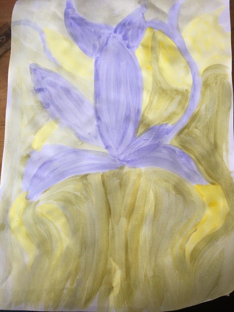
Stage 1 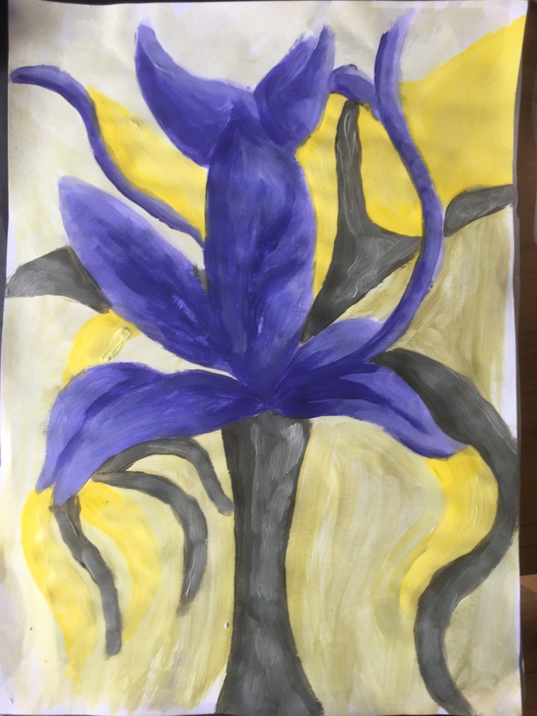
Finished Piece
Whilst I did not really focus on the more technical aspects of this subject matter, nor in the previous or subsequent ones either, I focused purely on how I could manipulate colour to suit my needs. Whilst I knew from my earlier exercises and research that the yellow and purple would sit nicely together and bring out the best of each other, I was quite concerned as to how the tertiary colour would affect the appeal of the piece as a whole, however, I was actually pleasantly surprised as I found it actually worked to bring a sense of harmony to the piece and brought the colours together as a whole. I was pleasantly surprised to find that I found the colour combinations in this piece to be rather appealing to the eye – my own eye, at least – and shall bear this in mind in future.
Exercise Five: Still Life with Colour used to Evoke Mood
For this exercise, I was instructed to try to create an atmosphere or mood with the colour within this piece, using the same subject matter as in the previous two exercises.
Whilst I was rather tempted to mix up the colours and use completely different ones – red and blue, for instance – or to make the colours very dark and moody in that sense, however, I decided not to do so, but to work again in the style of Agnes Martin, to attempt to create an actual piece in a very similar method, aiming for the closest hue to white each colour can get and to include a cool and calm atmosphere with that same sort of vibrancy as captured by Martin in her pieces. I decided to stay in series and used the same colours as originally, purple, yellow and green, however, this time I added a little blue for the background as I simply felt it needed this when I had completed the other parts of the piece.
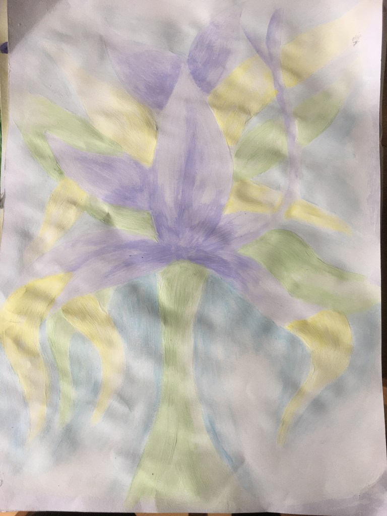
Finished Piece 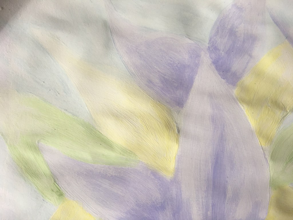
Detail Close-up
Whilst I do not think the outcome is immediately apparent or striking via photograph due to being created on a page which clearly was not stretched enough prior to use and also the colours being so pale, nor are the technical aspects of the piece accurate, I could not be happier with the outcome of this experiment as I thoroughly enjoyed the process and, as I think (hope!) has been portrayed within the detail close-up, the subtle changes in tone is actually rather well done, if I do say so myself! It is strange as, naturally, I am not drawn to light colours or brightness and much prefer heavy-handed, dark, moody and grimy, however, working in the way I have above really does appeal to me and gives me great satisfaction when able to achieve really subtle colours! I think, perhaps, that this may be something to consider for my assignment piece.
Comparison of Exercises Three, Four and Five’s Final Pieces
When I look at all three pieces together, I think it is rather apparent that the Impressionist style has been unconsciously invoked here! With not giving thought to the composition hardly at all, but rather the techniques with regard to the colours, I kept to the same paintbrush and did not really bother with trying to ‘fancify’ the piece in any way beyond the application of the paint – seeing the piece as just small sections of colour as opposed to a whole object / piece. I can see that this would potentially have been something similar to the way in which the Impressionists worked and why their pieces are rarely precise in their technicalities. When I compare all three pieces, I see that the first and third both interest me much more than the second. Whilst still appealing, the second seems much calmer when I look at it, but I am drawn to the vibrancy created within the first and third pieces much more. This is also something to bear in mind going forward.
