

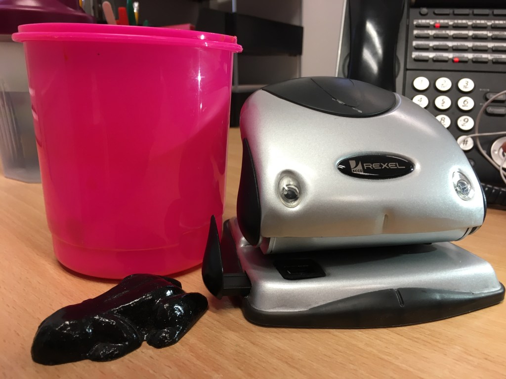
I began this project by preparing a group of objects (as instructed in Exercise 1) and creating tonal studies of them from different angles within my sketchbook:
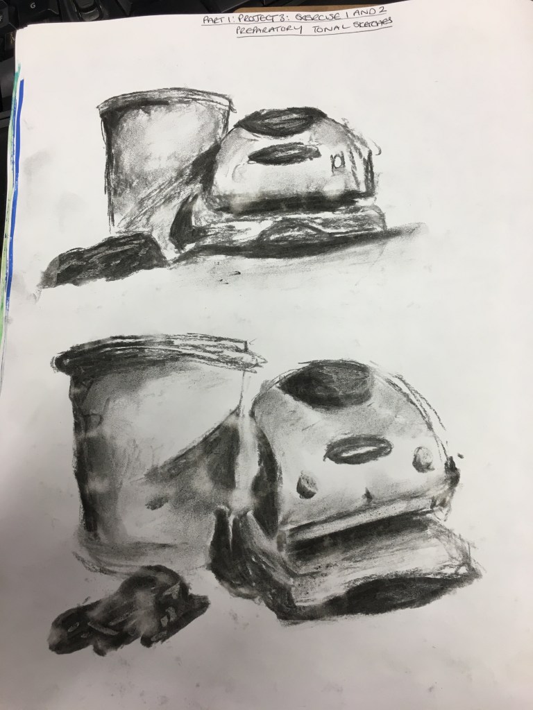
Page 1 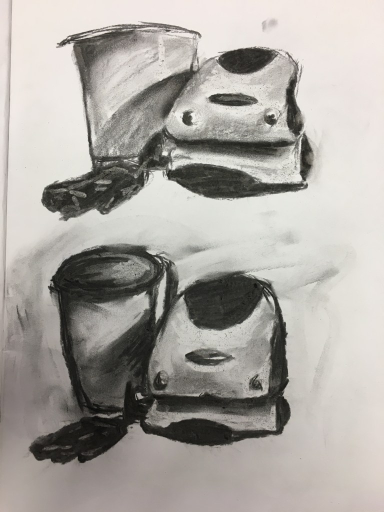
Page 2
From these preparatory sketches, I found I rather liked the angles on the first page and thought they worked best together. I decided upon a new angle which was a bit of a combination of both sketches, showing the objects in the same position as the lower sketch on page one, but from a similar height as that of the higher sketch on page one.
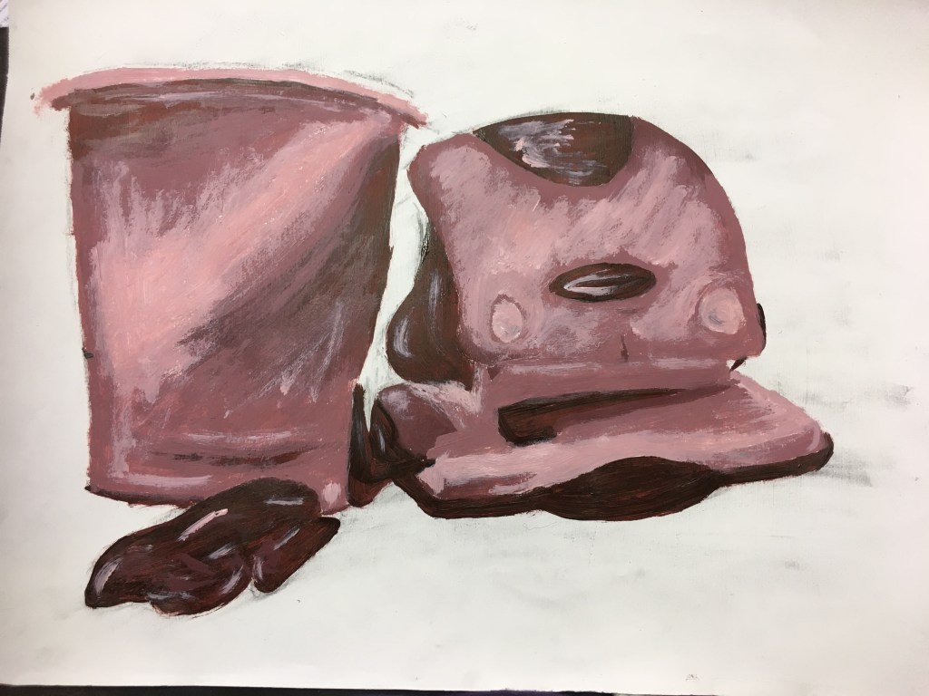
Exercise One: Tonal Study on White Ground
For this exercise, I primed an A3 sheet of cartridge paper from a sketchpad with gesso. Then, I chose a dark brown acrylic paint and used this to indicate the darkest of areas within the composition. To assist me with this, I squinted my eyes so I was able to see just abstract shapes of dark colour.
I then used white acrylic paint to create a lighter hue and then used this to fill in the areas which were much lighter in their hues. I then repeated this process and used white for the lightest of areas. I did find, however, that because I was working wet-on-wet, the white did blend in a little and ultimately became part of the pinker hue within the piece.
Research Point 1.3.1.1 : Chiaroscuro
To view the results of my findings for this Research Point, please click here.
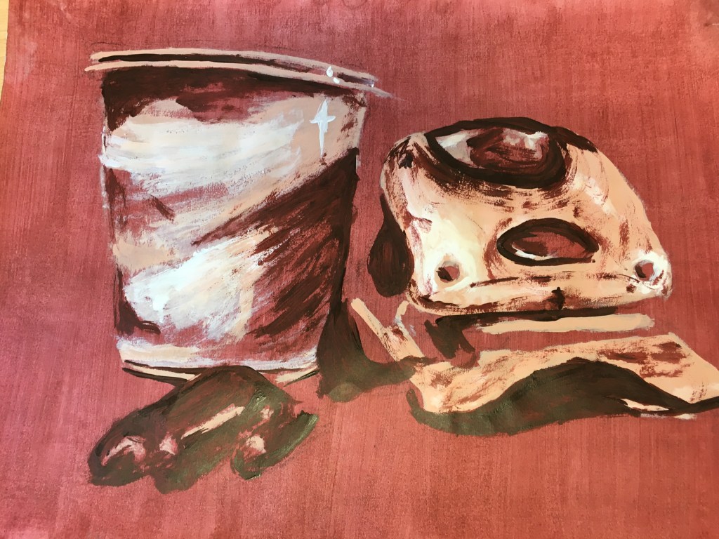
Exercise Two: Tonal Study on Dark Ground
For this exercise, I prepared a dark ground using a slightly diluted version of the dark brown I had used for the previous exercise, as well as a peach acrylic paint.
For this exercise, I lay down the darkest of the highlights first using the peach acrylic paint. I then used white acrylic paint to lighten this up and used this to create even lighter highlights, before finally applying a layer of white in places.
I found there were still a few areas which had no definition and the objects were not apparent enough, so I used the undiluted dark brown paint to insert these darkest areas.
Project Reflection
I think this project has been very useful for me in learning to distinguish between tones within a composition without necessarily seeing the actual objects themselves.
When comparing the white ground and the dark ground results, I think the light ground has been more successful in creating a finished piece, so to speak, and the objects are quite definable, however, I found that the base white colour was only really found in the background in the end as I had added the lighter colour in after building up the shades.
The dark ground, however, was much easier to integrate within the picture – or, at least, I think it would have been had the colour been the darkest hue available. I found my preference of building up the lighter areas worked much nicer in this way and that the background became more integrated with the piece itself as the hue could be found in different areas of the objects. As stated above, I do think this method does need a bit of help in distinguishing the positive spaces in some areas but, overall, I do enjoy this technique and this the end result is much more vibrant, warm and atmospheric, which are the things I am finding myself drawn to more as I am progressing on my journey.
