
Exercise One: Linear Perspective
For this exercise, due to the current pandemic and lockdown restrictions, I decided to paint my home. The course manual advised to create this piece solely in line so, having created something rather interesting in my earlier exercise with the human form, I decided to attempt to translate that method into this type of exercise.
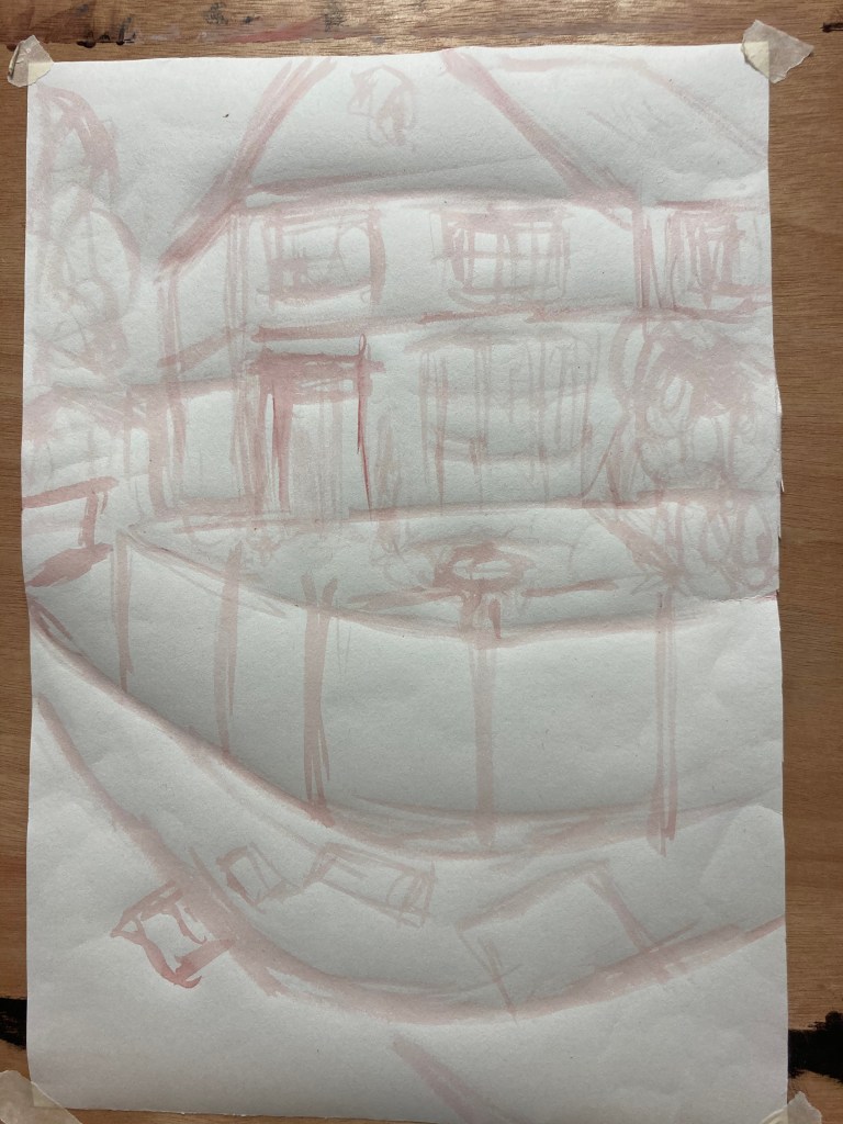
Stage 1 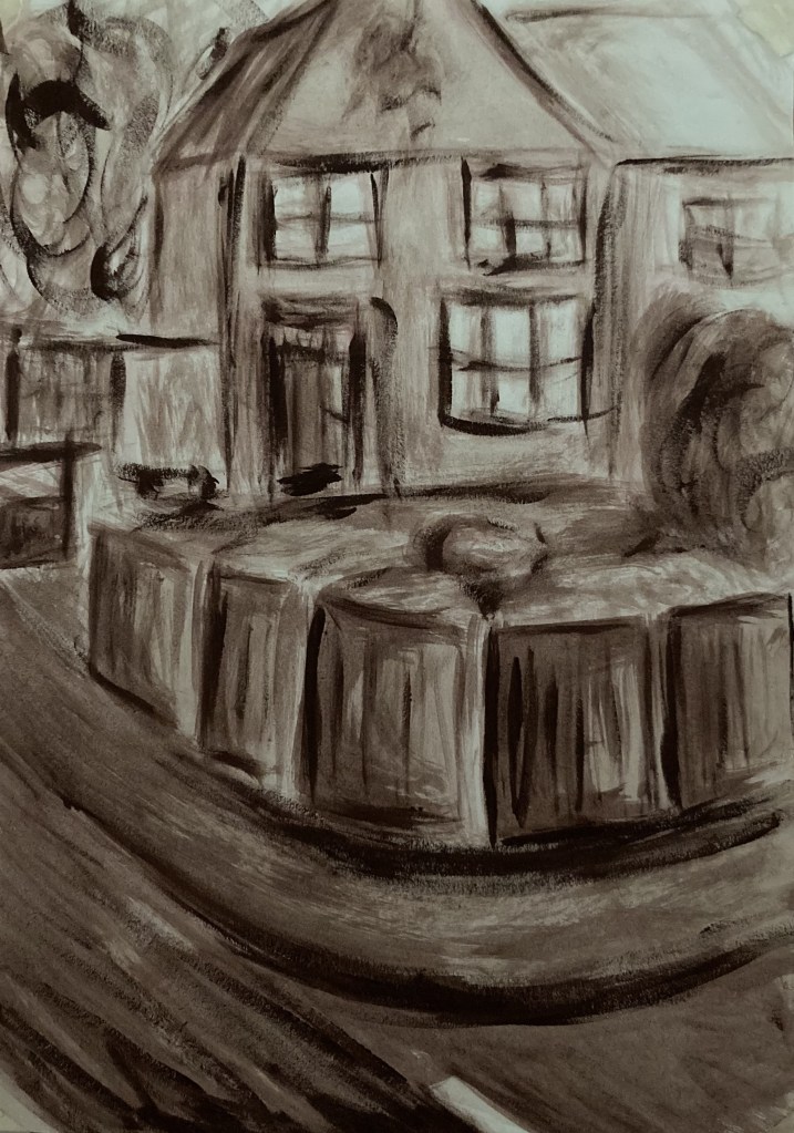
Finished Piece
Overall, I feel this has been rather successful considering perspective work such as this does not really appeal to me and is not my strongest of areas. I think my suggestion of line has been rather successful, notably in the suggestion of the attached house; just subtle enough to know it is there, but not of any importance. I also think I have managed to create a good sense of depth simply by using line, especially around the fencing and the curve of the road. I do think there is a look of childishness to the piece, however, I quite like this as it reminds me of how as a child I would regularly draw a house, path, garden and tree etc, so the naivety of it is actually rather reflective of recreating one of my favourite childhood exercises. Whilst there was no call for tone in this exercise, I think adding that slight wash to the piece did help in creating a solid structure as opposed to just a line drawing.
Exercise Two: Aerial Perspective
For this exercise, I was to create a piece in which there was a controlled loss of focus, saturation and the sense of distance created.
Having worked with palette knives previously and having found them good for sharp angles as well as having worked on building up different colours and transparencies coming through earlier in the course, I decided to attempt to create a series of mountains from imagination and allow them to develop as they would with the use of the knives.
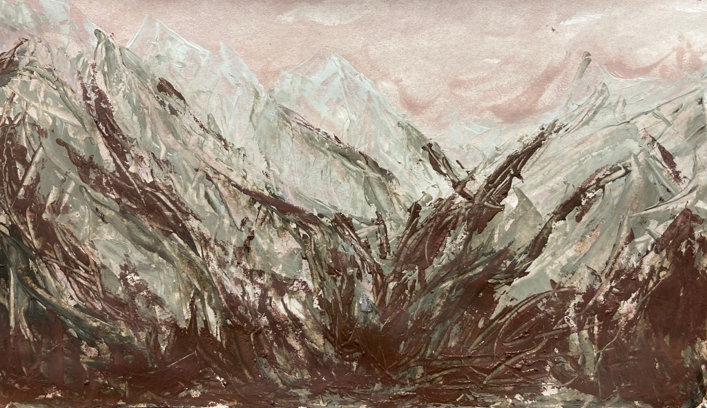
I began by applying a wash of what would be my darkest colour for the sky. I then took another colour from the same family of browns and mixed it with a fair bit of white. Slowly but surely over several layers, I added more and more of the second brown (raw umber) to create depth, shadow and texture within the body of the mountains. Once I had finished this, I returned to my original brown colour which had more of a reddish tint to it and applied this over the top, creating a darkness within the valley of the trees.
Overall, I am actually rather pleased with this result, especially when I consider it was from imagination as it has come together rather well and does resemble mountains. The marks within the mountains themselves do create a realistic texture, however, I think the final application of brown may be slightly overbearing. On reflection, I feel there should actually be a sense of calmness to the lower central area of the valley as opposed to the choppiness of the rest of the mountains. I really do like the colours which come through as a result of the layering and scratching etc, so this is definitely something to bear in mind going forward and could actually assist with creating backgrounds where usually I would be too precious since I am unable to fully control the paint in this manner.
