
Research Point 3.2.0: Self-Portraits
The results of my findings for this Research Point can be found by clicking here.
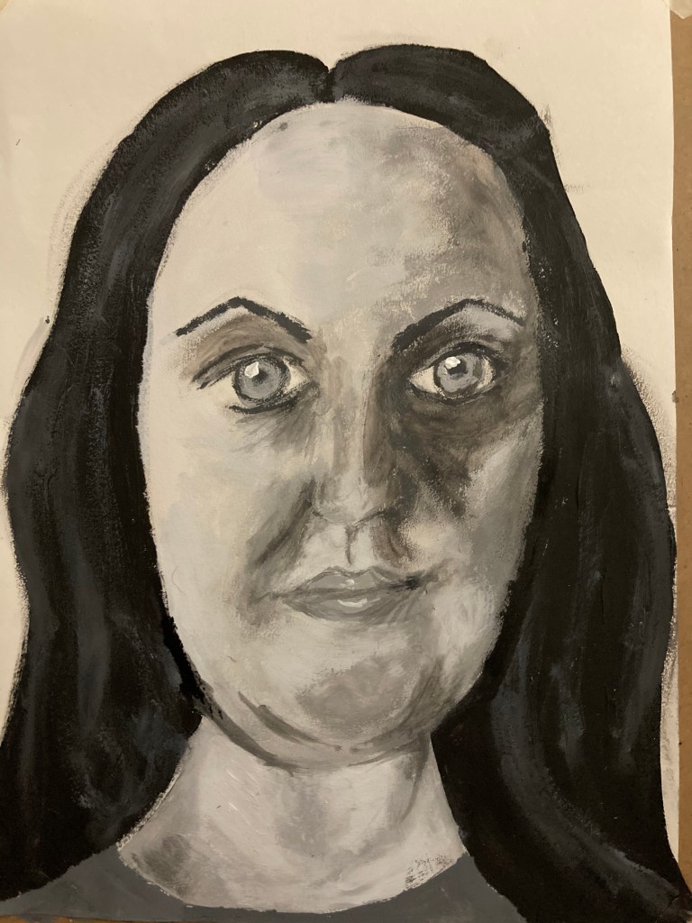
Exercise One: Self-Portrait
For this exercise, having read that I should look at myself from different angles and with different expressions, I decided to begin by using a wash to create a quick study on the same piece using the same colour and layering each position over the last to create a sense of movement in the piece.
I then created a second piece using the previous study as a basis to build from.
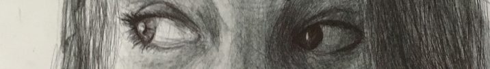
Having finished this piece and having stepped back from it, I can see somewhat of a likeness within the piece, however this is not very strong. I feel this is still quite a success though, considering I was working rather quickly over several sittings, had no guidelines to assist me, nor was I able to see myself as I would a model seated in front of me. There are several areas where I feel I have struggled, including keeping the perspective and angles accurate – my face appears to turn slightly in different areas. In real life, my nose does have a slight twist in the bridge due to having been headbutted by my youngest several times when she was a toddler! However, I do not think this translates very well within the piece and creating depth is rather hard to do in this area. Having said that, I am quite happy with the depth created within the shadowy areas and the subtle change in tone. I think I have been rather successful in providing a sense of life within the eyes and mouth also.
Overall, I rather enjoyed creating this piece, but feel rather disappointed with the lack of resemblance as this is something which is rather important to me within my life drawing work. I do feel using grids does assist me with keeping the accuracy of the features’ placements and will consider this further as I progress through the course.
Exercise Two: Head and Shoulder Portrait
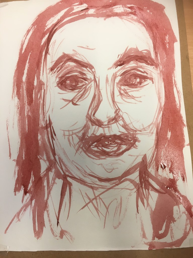
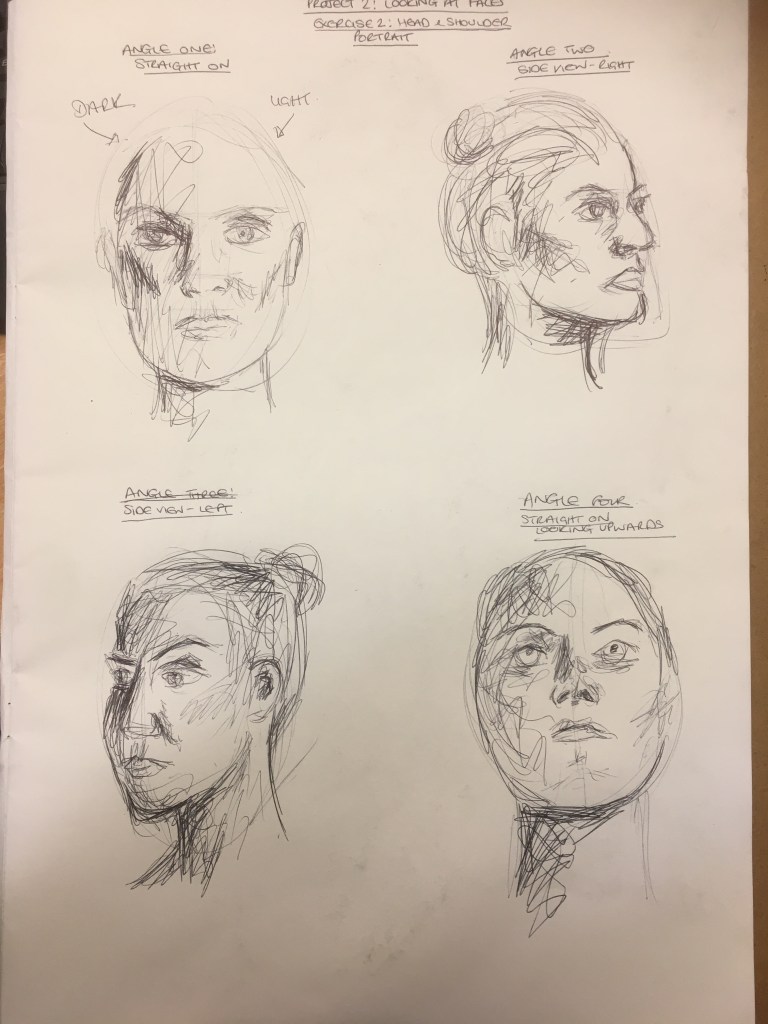
For this exercise, I began by creating some quick studies within my sketchbook as to different angles and the lighting effect from these angles. I settled on a forward but slightly raised facing angle as I felt this was the most powerful to use. Whilst the angle was good for the tonal contrasts, it was also very powerful in a way which would be hard to recreate from another still, featureless pose, and so I felt this would work extremely well.
I began by creating an under-painting using a wash I had prepared earlier and when I had finished this part, I was torn as to where to go from here. I really felt that the piece was extremely powerful as it was and knew anything more would simply be overworking it. I decided to proceed and, again, the same feeling occurred in the second stage. The contrast in the tones was extremely strong and powerful. Again though, I felt this would not be enough to complete the exercise, as well as wanting to explore painting flesh more, and so I continued until I reached a stage I was happy with (Stage 5). I had decided this would be my finished piece, however, having taken a step back and looking at it with fresh eyes, I realised I had changed the shape of the eyes and that they were now far too deep, needing a flatter bottom line to assist in the illusion of the subject looking slightly upwards. However, I decided that to continue would definitely ruin the piece as I was not 100% sure as to how I could correct this.
Sketchbook Studies 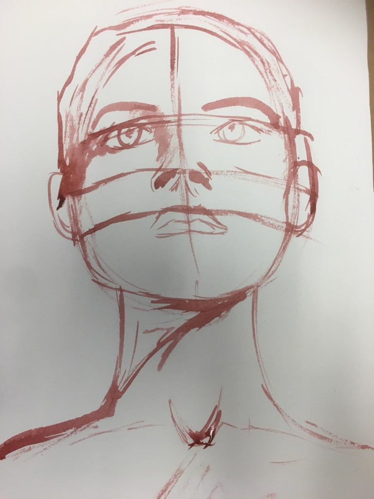
Stage 1 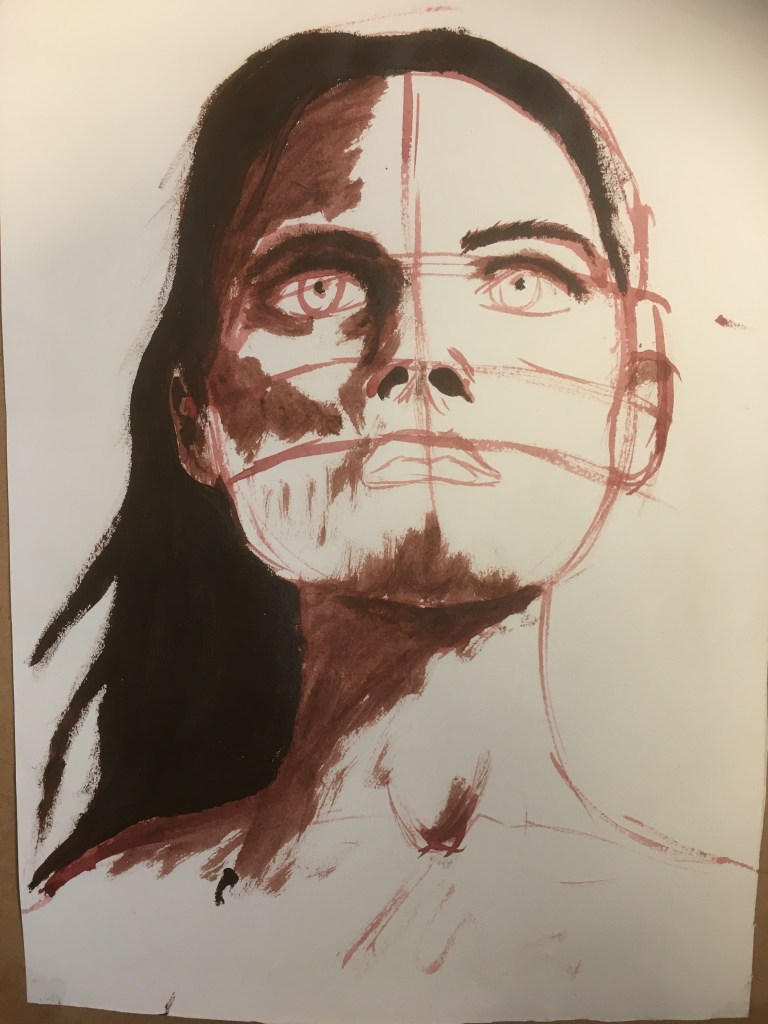
Stage 2 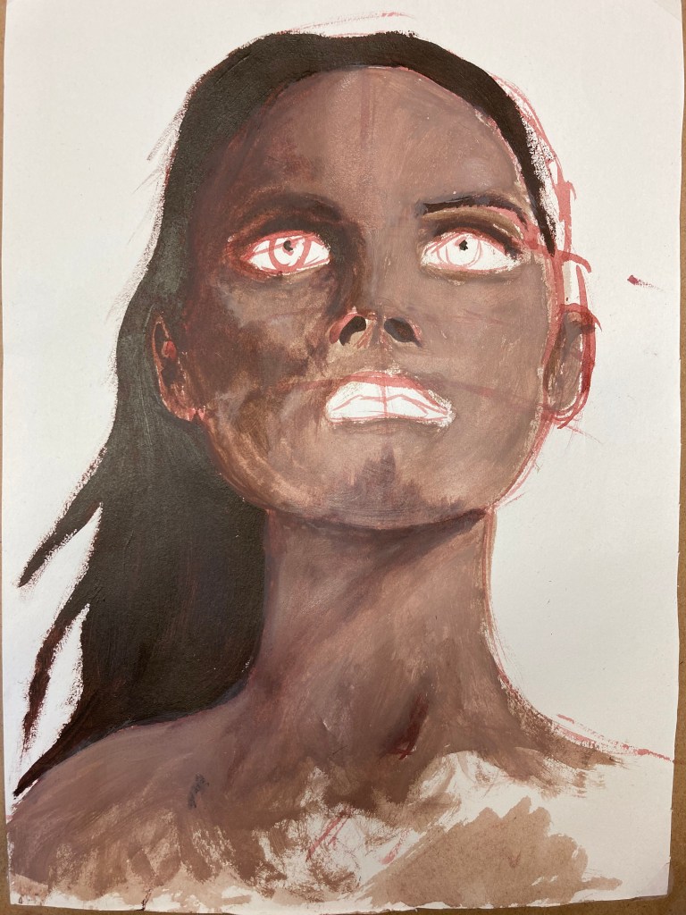
Stage 3 
Stage 4 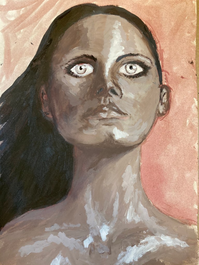
Final Piece
I decided to leave this be and see it as a learning curve, but also find it rather mesmerising at the same time; I am really pleased with the life created within the eyes and the colour of them, but I also feel it adds a surreal, ethereal feel to the piece and adds a touch of the sinister to it. Something I feel my work seems to take on without my willing, and something which I am happy to continue allowing to progress naturally. Overall, I feel this piece has become one which would actually fit rather well within the third exercise of conveying mood and atmosphere. One thing I did notice during the creation process, however, was that the more I worked, the freer I allowed my mark-making to become. For my remaining pieces within this project, I want to delve deeper into this and worry less about resemblance.
Research Point 3.2.2.1: Moods and Atmosphere in Portraits
The results of my findings for this Research Point can be found by clicking here.
Exercise Three: Creating Mood and Atmosphere
After struggling with achieving accurate skin tones in the previous exercise, I decided to carry out a little research into the creation of skin tones with paints. I came across a reference piece in respect of the same and decided to replicate it myself to be able to understand it much better than just relying on a found image.
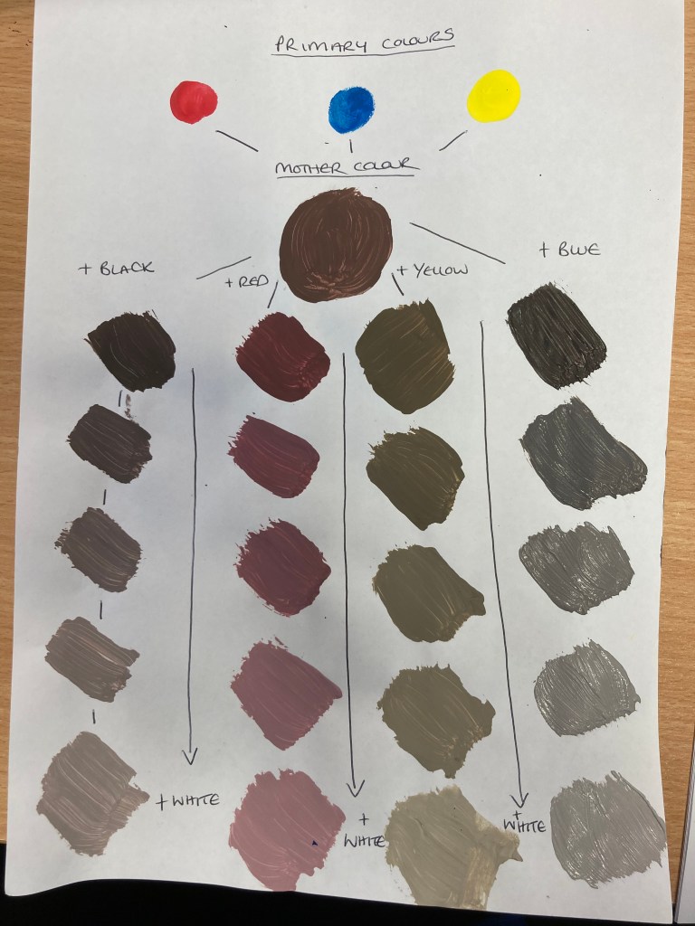
Whilst I still do not think I had managed to get this quite right, it was a good experiment to carry out and one which I feel will help me when creating further pieces in the future. However, when it came to creating the base colour for this exercise, I decided to add some Raw Umber to my mother colour to create a less dull colour.
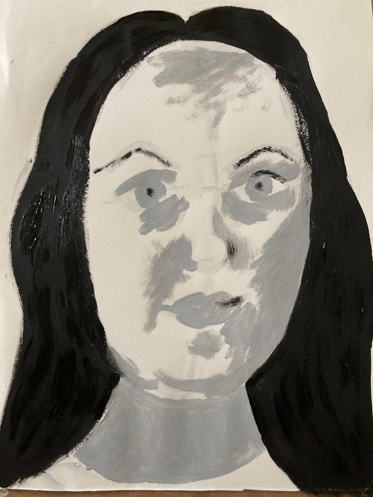
I then decided to use what I had learned and, remembering that this exercise is to create mood and atmosphere, I had earlier settled on creating a piece showing myself in a moment of sheer rage. Having created the above reference chart, I was able to see that the addition of black and blue to the mother colour created a much colder and sinister flesh tone and that these would work much better with the atmosphere I would to convey within my piece and so settled on using the addition of black. The colour was rather red still, however, I decided to work with it and see where it would take me.
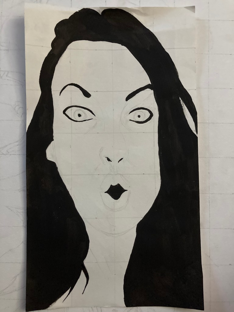
I began by drawing a grid and putting a base picture of myself down onto the page. I then began building up my layers from the darkest to lightest by adding a touch of white for each layer and sometimes a touch of raw umber again to keep the colour related.
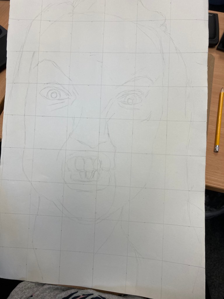
Stage 1 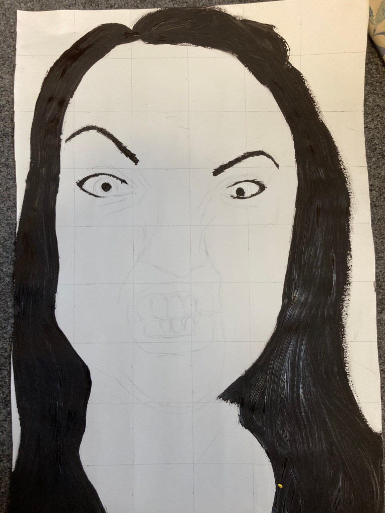
Stage 2 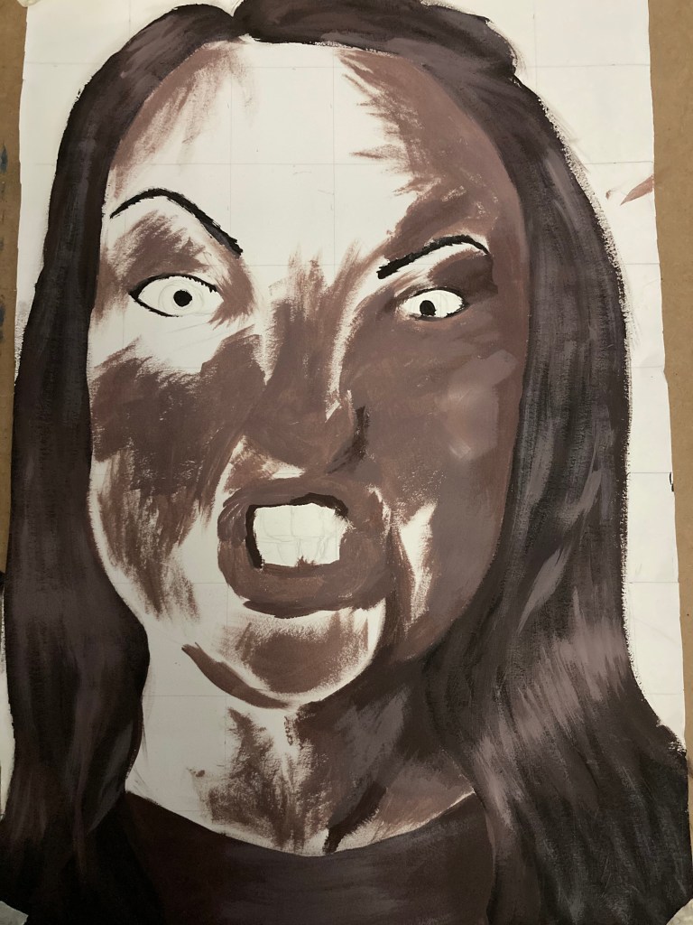
Stage 3 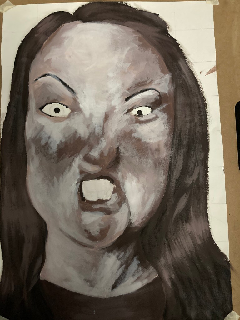
Stage 4 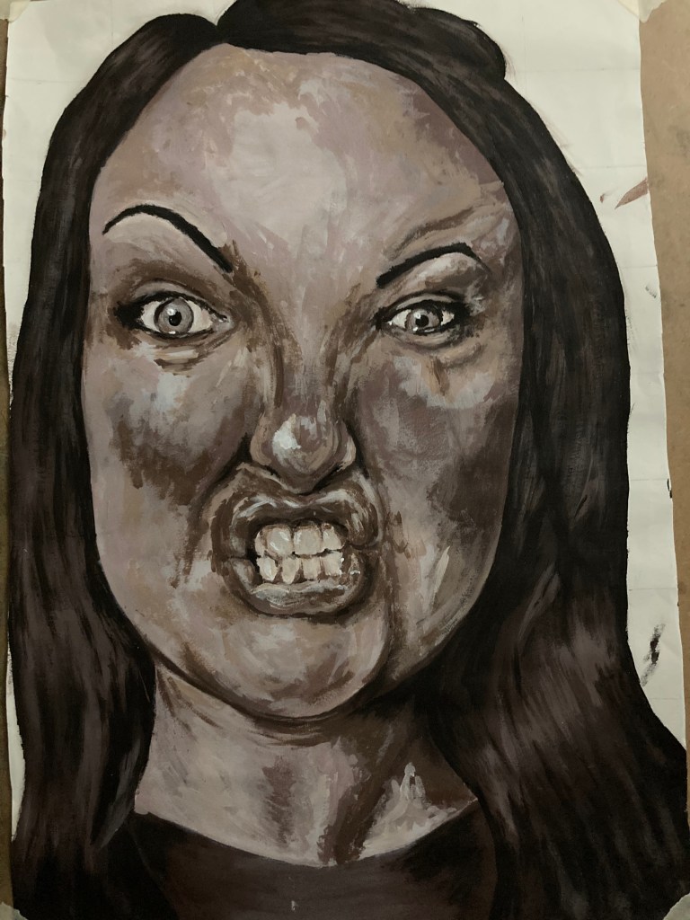
Finished Piece
I am actually rather pleased with the end result and think it has been rather successful in places such as the mouth, nose, and chin having a great amount of depth to them, as well as the life I have managed to create within the eyes. I am, however, a little disappointed that I have somehow allowed the spacing between the eyes to drift too far and, were I to go back, I would have deepened the shadows around the bridge of the nose, extend the size of the right (as looking at it) eye and eyebrow. I feel the eyes have been much more successful in this piece as I have added shadow both within the eye and within the inner corners, so this is something to bear in mind going forward.
I feel this exercise has really helped me improve my technique and that I have expanded this as follows: firstly, I develop a mother colour, then I work my way from darker to lighter within the piece, creating layer upon layer before finally going back and touching up the dark areas which have become somewhat dulled down by the layers but actually require more depth and contrast. I really find this technique works well for me, however, I am always looking to refine my process and accuracy. I think I do need to step back more often and look for areas where I may be starting to lose the likeness and correct it at this point as opposed to trying to correct it at the end or simply leaving it incorrect.
Exercise Four: Conveying Character
For this piece I decided I wanted to show a rather opposite side of myself to the piece above and to include the more fun, quirky side of my personality. I remember doing a piece where I was showing a ‘shocked’ expression in my first course and wanted to recreate something very similar to this as I found it rather interesting and exciting. I decided that, whilst my tutor has recommended the use of a limited palette, I wanted to introduce a little colour within the work and to expand my palette just a little to include some pink and blue. I also wanted to create a piece which was slightly distorted as to the length of my face, to emphasise the expression being made and the quirkiness as well. To push this a little further, I wanted to create an almost cartoon-like painting, but reserving my expressive nature within the different parts of the piece.
I began as before and took a photograph of myself creating this pose by the side of a window, leading to natural light on the right side of my face and shadows being created on the left-hand side. I then filled in the block colours of the different areas of the piece using the darkest tonal values for each. I then began working up the layers to their lightest values and then working in reverse to create the finer details within the piece.
Stage 1 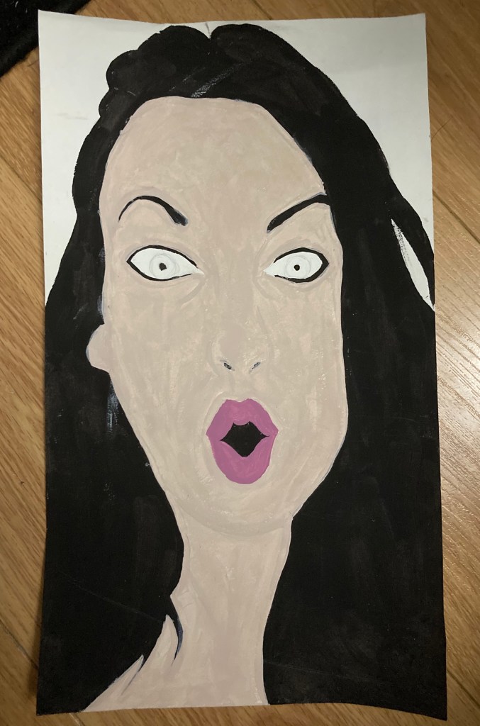
Stage 2 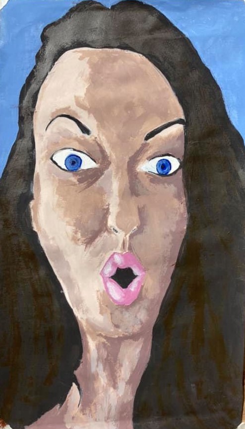
Stage 3 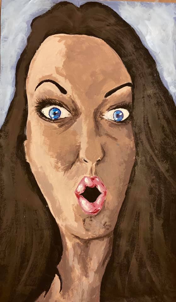
Final Piece
When I had finally reached a stage where I felt it would be wrong to continue and that the piece had reached its natural end, I then took a step back in order to be able to reflect accurately.
Overall, I thoroughly enjoyed creating this piece and working in a much ‘happier’ way. I also enjoyed the limited use of the two other colours and feel they helped make the piece ‘pop’ – giving it a slight hint of the Pop Art technique. Whilst I do not find Pop Art as a whole all too appealing for myself, I rather enjoyed creating the rather ‘juvenile’ colour scheme and effect, as I feel this adds to the overall intention of expressing a slightly quirky and fun character.
Comparing the Pieces
Exercise 1 Exercise 2 Exercise 3 Exercise 4
Looking at the four pieces side by side, I think it is instantly apparent that they all hold a rather ethereal atmosphere within them. The first three exercises are rather sinister and I am actually rather pleased with the eerie feeling created by the eyes. I think this may potentially repulse viewers, but in a way that they feel they need to keep coming back again and again, just as with an aching tooth one cannot resist prodding repeatedly with their tongue. I also really like the effect created with the shades of brown within the second and third exercises. With regard to realism, I think the fourth exercise is by far the most realistic and I am really pleased with the realistic colouring of the flesh within this piece and I think the application of the paint has been really successful to show the different tones coming through. Whilst the fourth piece was meant to be quite healthy and happy looking, I would like to do a more realistic looking piece showing the redder tones of the flesh and also the greener tones in such places as under my eyes. I think that could make a rather sinister piece in itself, so this is definitely something I want to try.
Bibliography
My Blue Print. (2015) ‘Painting Realistic Skin Tones’ [Online] At: https://www.mybluprint.com/article/an-easy-method-for-mixing-acrylic-paint-for-skin-tones (Accessed on 19 August 2020))
