

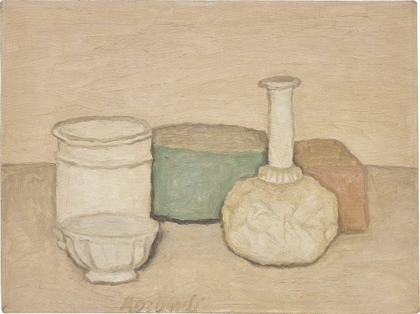
I was a little perturbed by this assignment as do not feel I have been given much in the way of direction to aim towards, however, I decided to work from what I had learned in my earlier course and draw on certain aspects with regard to still life. After looking back through previously researched artists, I settled on Georgio Morandi and his very stripped back, subtle way of looking at the world and the subjects of his pieces.
Sketchbook Preparatory Work
Compositional Studies
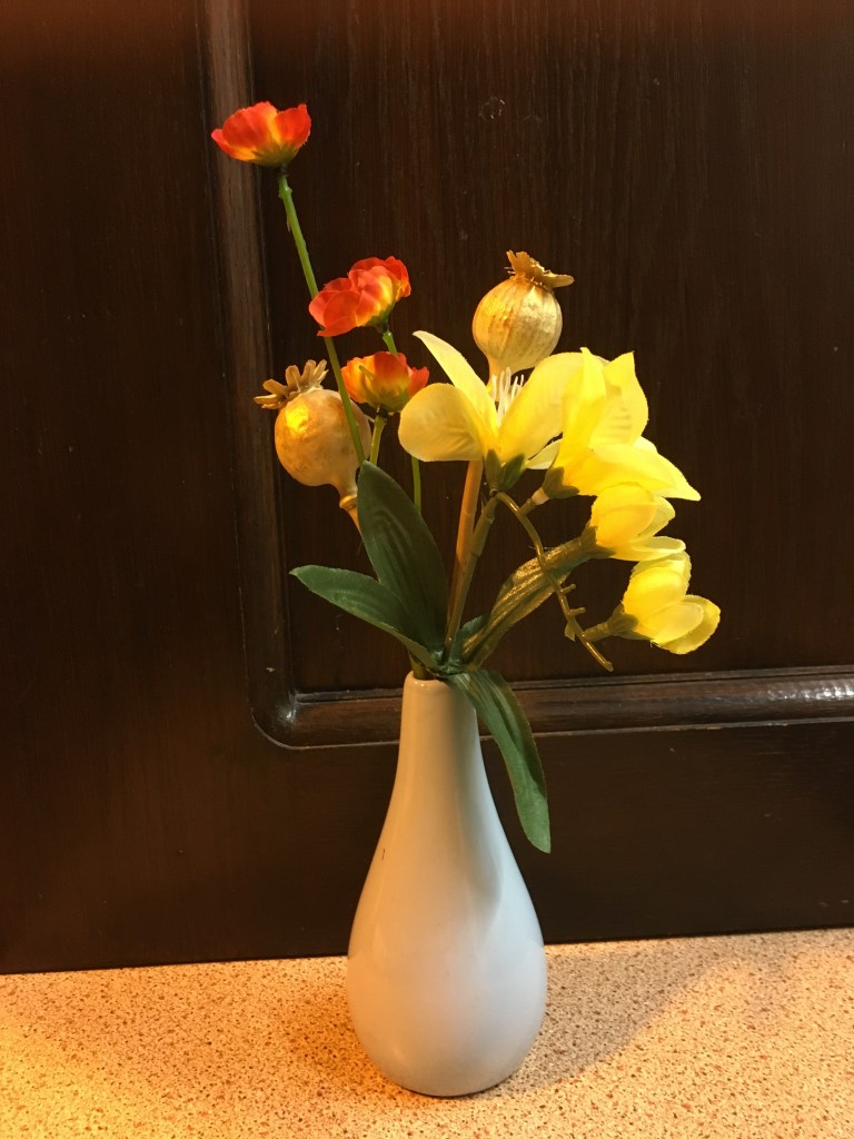
Angle One 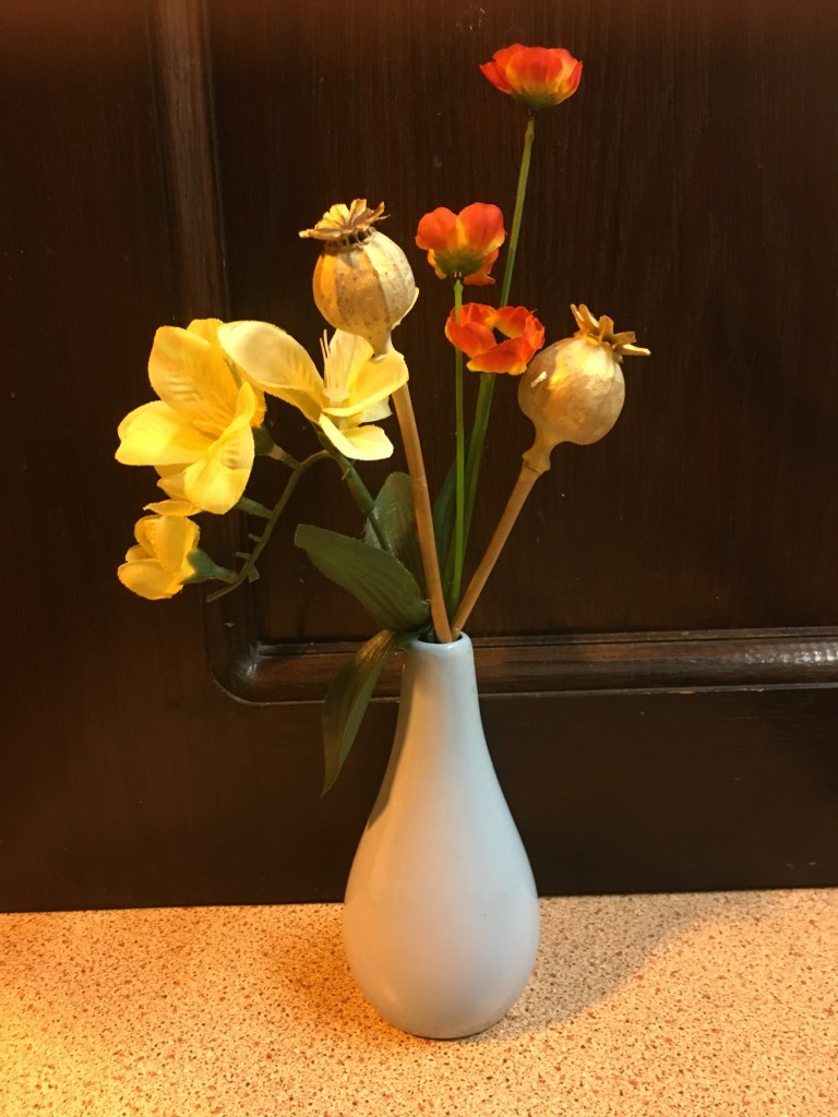
Angle Two
I began this assignment by choosing to work with a simple vase with a small amount of different flowers in it against quite a bland, but clearly separated and contrasting, background. I turned the vase around on the spot several times, but found there were actually only two angles which were particularly interesting, however, I could not decide which I preferred between the two, so I decided to draw a quick sketch of both in my sketchbook to assist me in working out which would be the most appealing to paint.
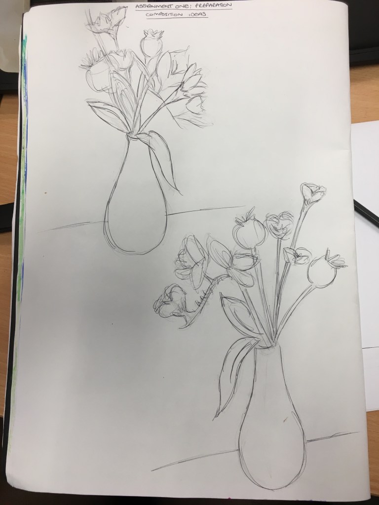
From the process of creating the sketches and from observing the end results, I decided my favourite composition was actually the one in the top left hand corner as I liked the intimacy of the different flowers as opposed to the wide and separate spaces created in the lower right. I also felt that the movement of the flowers diagonally from left to right created a nice balanced flow for the viewer, whereas the lower right image did not seem to really have much sense of natural flow and I think would lead the viewer to be slightly overwhelmed as to where to look first.
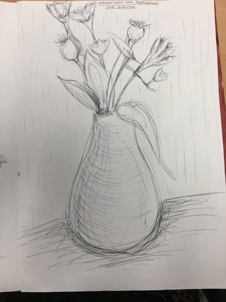
Line Study
After choosing my composition, I decided to create a line study of the composition on a larger scale. I tried to stay quick and fluid for this study and focussed more on where the lines should be and where line could be used to indicate shadow and depth.
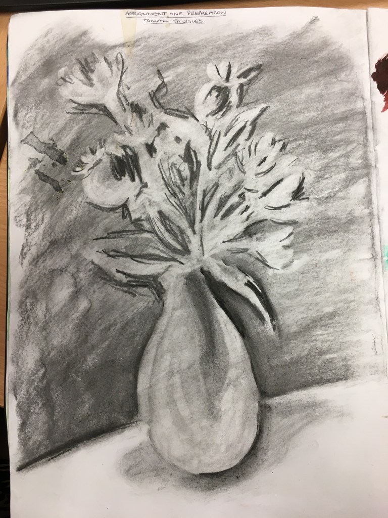
Tonal Study
I then created a tonal study by colouring the majority of the page in charcoal and then smudging it. I then lifted the charcoal with a rubber for the places where the highlights were strongest and then deepened the darkest areas with another layer of charcoal to create the definition. If I were to have taken this further and it not just be a quick tonal study, I would have applied a much darker layer in the background to intensify the contrast between the light and dark areas. Also, the darker I could make the background, the more layers of highlights I would be able to create within the lifting process.
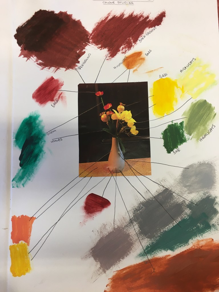
Colour Study
For this area, I began by looking through squinted eyes at my composition so as to be able to work out where the darkest areas were within the composition. I then tried to consider the hues which would best represent these darkest areas and created spots of the colours in my sketchbook to remind me of what should go where. I then created further spots of the colours I would use to create the lighter areas and then the highlighted areas. I drew arrows to each part for each colour.
Final Piece
Initial Sketch
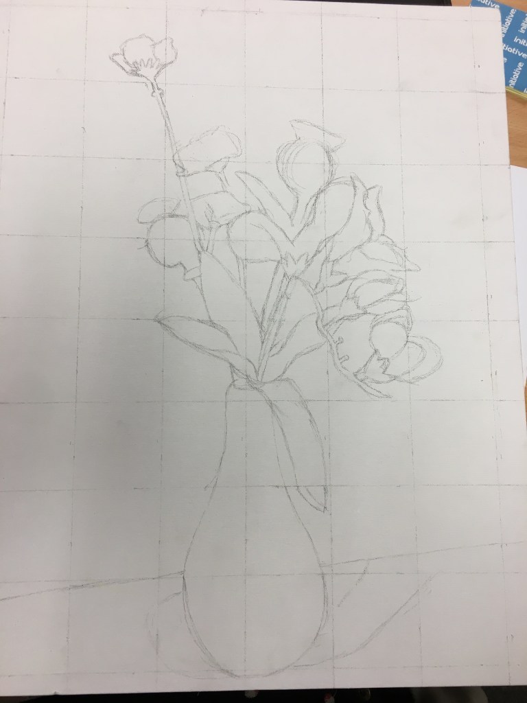
I began working on my final piece by taking a photograph of my chosen object and created a grid on the photograph which I then recreated on my canvas to a larger scale. Whilst I wasn’t going to work from the photograph to create my final piece, I find this system very useful in being able to achieve good proportions and scale before adding the detail. By creating the grid, I also find that this helps me break down the full object into more abstract chunks which allows me to work from what I specifically see, rather than what I know which assists in keeping the representation accurate.
Base Colours
After laying out the composition on my canvas, I then proceeded to lay down all of the base colours for the piece, looking through squinted eyes for the darkest areas and then
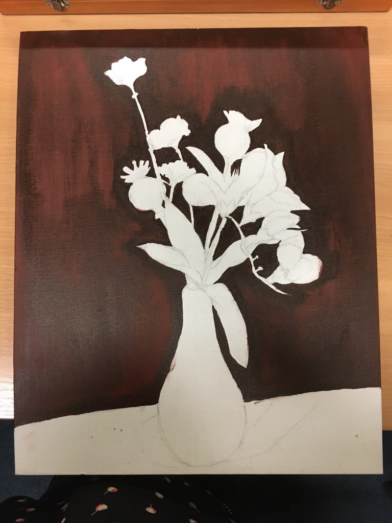
Base Colours Stage One 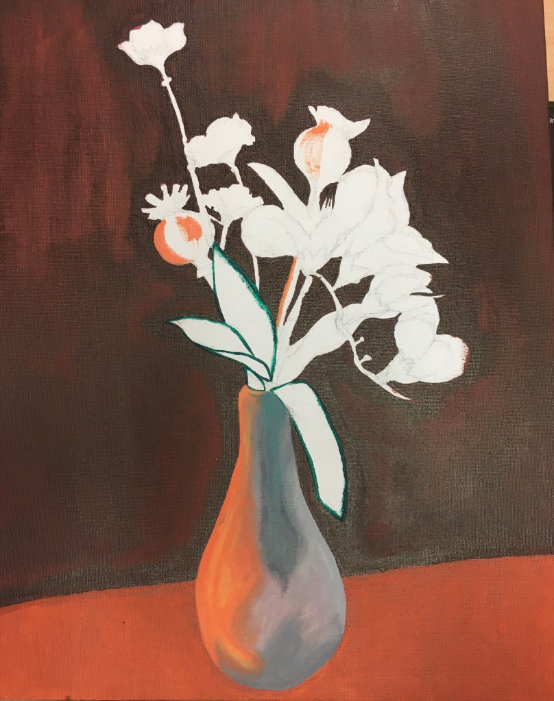
Base Colours Stage Two 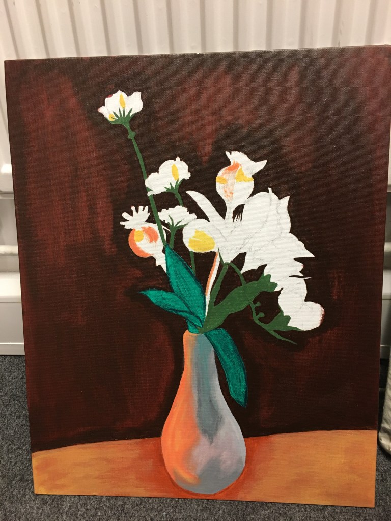
Base Colours Stage Three 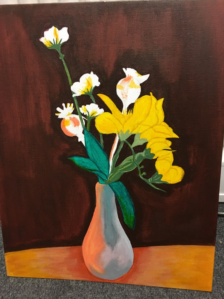
Base Colours Stage Four 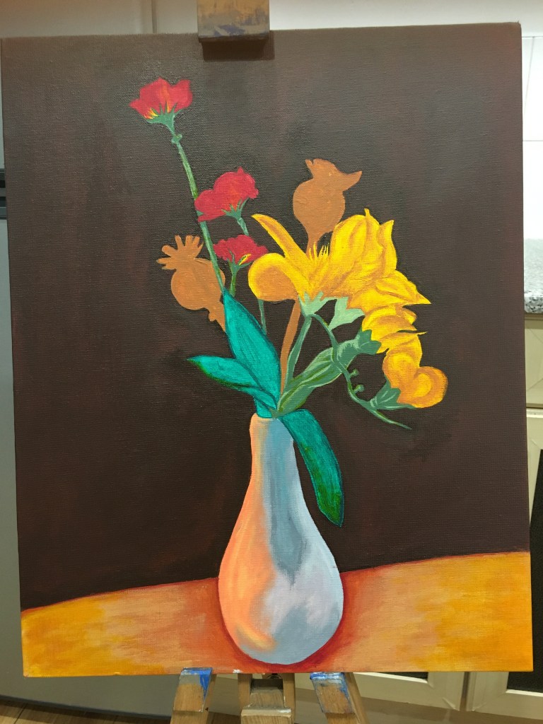
Base Colours Stage Five
Stage One
I began painting by applying a brown to the upper background, which was actually a door in kitchen hatch. I was a little disappointed with the application of this colour. I had used the brown to create an outline around the positive shapes, but by the time I reached the stage of filling in the rest of the background, I noticed that the outline actually stood out. I figured this was probably because I had then applied two layers in those areas, the first of which would probably have been much thicker than the second due to the second being spread thinner with the broader brush used.
Stage Two
Next, I applied the darkest colour of the work surface and the base layers of the colours in the vase. I was actually fascinated by the vase as, whilst I had chosen it as a simple object due to its shape, I found rather quickly that the white vase I had chosen was actually not very white when seeing it through an abstract shape method focussing solely on the shapes of the colours and the hues of them too, the majority of which I had found to be quite grey with another reflected colour included from the surrounding bolder colours.
Stages Three and Four
I then moved on to adding the base layers of the stems and leaves within the piece, focussing on the darkest colours seen. I added a little of the highlights in the stems and leaves which I could see to add a little depth to them. I also used some of the colours used for the flowers to try to lift the base colour of the work surface. I figured that by using the same colours in different areas of the piece, this would give a sense of uniform and relativity to the different components within the overall piece.
Stage Five
For the final part of the base layer process, I added the final darkest colours seen within the red flowers. I then used this same red to define the shadow at the base of the vase to try to bring it more into the foreground and moving the door and worksurface further backwards into the piece to create the illusion of depth.
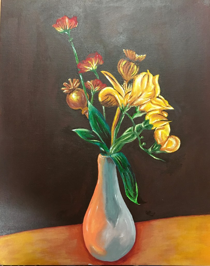
Highlights and Finishing Touches
I finished my piece by adding highlights and refining shadows, as well as adding depth to final areas of my piece. I tried to avoid using black at all within my piece as I feel black is not a natural colour to find, rather a darkened shade of a related colour (such as how I have used dark brown toward the bottom of the tallest standing leaf) as I feel this is a much more natural shade, whereas black would just be too flat. I also tried to use a lighter version of some of the colours (such as the yellow in the flowers) as highlights, with only slight touches of white for the very lightest of areas.
Reflection
Upon reflection, I think I have been very unsuccessful in creating a piece in the style of Morandi! I haven’t used muted colours whatsoever and merely allowed myself to do whatever came naturally, using the colours I had found within the piece during my earlier experiments.
I tried to work as realistically as I could and following the prompts within the course textbook to paint in a way which represents the real objects as I saw them, but allowed the painting to form its own personality during the creation process.
I am actually very pleased with my finished result and the detail within it. Having a tremor and having to contend with it when trying to make straight lines and edges, I am actually really pleased with how smooth I have managed to get these areas. I also really like the range of colours I have been able to see during the process.
I think the strongest area within the piece is the vase and the reflected colours I have been able to translate into the piece with the paint. I was very conscious of my earlier tutor’s comments regarding my colours appearing flat and wanted to try to work against this, so I applied a lot of effort into doing so. However, I do think now that having been too concerned as to not use black paint, I have gone too far the other way and used too much white within my piece! Whilst I think I may have made my subject look a little ‘plastic’, I think I actually like working with warm colours and atmospheres and that this is a route I am drawn too naturally.
I still feel I have a long way to go to achieve a more personal approach and don’t feel I have really applied much of my expressive nature within this piece, however, this was purely due to the request to keep the end piece realistic within the course textbook.
I hope once I have learned a little more about techniques and so on that I will be able to manipulate them much better, however, I do think this assignment was extremely useful in helping me visualise and understand the restraint and more delicate methods available to me as when I come to being more expressive, I will be able to reel myself in with better control for finer details and avoid overworking my pieces.
List of Illustrations
Fig. 1. Morandi, G (1952) Natura Morta [Oil on canvas] At: https://www.metmuseum.org/art/collection/search/492699 (Accessed on 13 March 2019)

One thought on “Assignment One”