
Tutor Feedback Comments
Overall Comments
I was really pleased to read my tutor’s feedback and the positive response to my work. I agree that I should spend as much time as is allocated to me to complete exercises, but found this part of the course to be rather short and basic compared to others in the previous course. Hopefully, the next part will require more ‘effort’ from me and be more challenging / exciting.
With regard to colour choices, combinations and sensitive arrangements of colour, again, hopefully the next part of the course will lead me to avenues in which I can experiment further with this.
I will definitely try to see the course handbook in a more ‘base level’ way, however, I still feel the exercises are more of a stepping stone to reaching the final destination to the assignment pieces. I enjoy the lesson to be learned in each exercise more than the detail created in the learning process.
Feedback on Assignment
I’m pleased to note that my tutor feels I show confidence in my medium choice and a good understanding of how to construct pieces. I’m glad to note that my tutor feels I have shown attention to the intricate and delicate areas of my piece with a good application of paint and spatial awareness. I’m also pleased to see my tutor’s appreciation of my reflection and awareness of areas to improve in next time.
I will definitely work on my tutor’s suggestions to create fluidity within my mark-making, allowing edges to develop loosely as opposed to tightening them up and to allow myself to work both consciously and mindlessly at the same time. My tutor also made suggestions to work more intuitively, allowing my pieces to evolve naturally, which I will also bear in mind moving forwards. I also like the suggestion to use more limited palettes such as earth tones and subtle colours within my pieces moving forward.
Process / Material Research
For this part of my feedback, my tutor made comment regarding my fluid and economical use of paint in my exercises, which got me thinking that perhaps I should attempt to draw on these things for my assignment pieces. I find that I tend to work more freely and quickly within my exercises due to not being so concerned with their end result, being more concerned with the learning process, as stated above, whereas in my final assignment pieces, I tend to apply much more effort and restraint. Perhaps this restraint is actually stifling my creativity and rawness. Perhaps I should avoid overthinking my assignment pieces moving forward.
From reading my tutor’s feedback, I can see that my tonal studies and variations are strong. Perhaps this could be something I focus on more in my assignment pieces as opposed to ‘pretty’ final pieces. Perhaps tonal studies and works are more the direction in which I should be developing my work and my path.
Research: Classical Dark to Light Technique
Working from dark to light is a very traditional concept and one which developed with the introduction of oil painting. Base oil colours are rather dark in their hues, but also rather thin. To lighten the hues of oil colours, artists will mix the colour with white, but doing so not only lightens the hue but thickens the paint at the same time. The lighter the hue becomes, the thicker the paint becomes. This is also true for acrylic paint, but not for watercolours due to the way in which they are created. If one looks upon the paintings by the Old Masters, they will see how the darkest areas are rather thin but the lightest areas are much thicker and stand out from the canvas. These artists would begin their pieces by filling out the thinnest, darkest areas in the piece first and then working up through the hues until reaching the lightest, thickest hue.
Whilst I much prefer working in acrylics, having carried out the exercise where I was asked to introduce more and more white paint to a colour, showing the thickening effect, I feel I now have a much better understanding of the reasoning for working in this way and can definitely see this assisting in my own work going forward and a technique which could actually speed up my processes by giving me a sense of ‘structure’ as to where I should begin, where I should continue to and what my finishing touches should consist of, in a similar way to how I sketch out my composition before beginning any work at all to assist with clarity.
Written Research / Critical Essays
I’m really pleased that my tutor can appreciate the effort I apply to my research and my attempts at personalising my responses. I fully agree with the suggestions as to the type of questions I should be asking about the artist’s intentions and meanings of pieces, and how I can transfer these findings into my own pieces. I will definitely be applying these further in my future researches.
Learning Logs or Blogs
I am happy to see that my learning log continues to be articulate and reflective. Again, I fully agree with my tutor’s suggestions regarding questions to consider when developing my research, pieces, processes and reflection.
Suggested Reading / Viewing
Agnes Martin: Understanding of Light Values
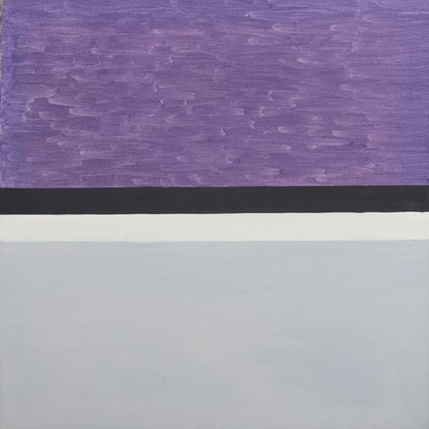
Fig.1. Martin, A Untitled (1959) 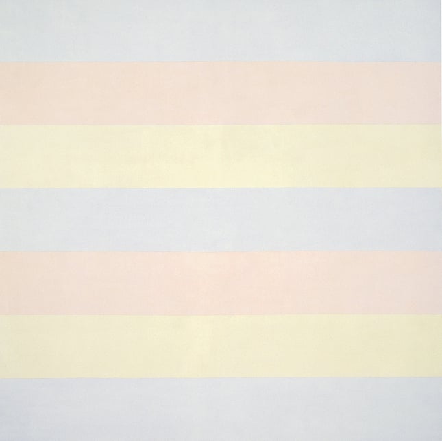
Fig.2. Martin, A Untitled (1998) 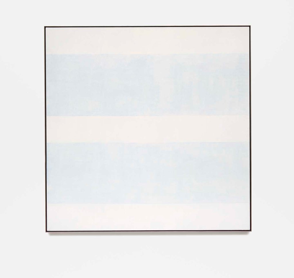
Fig.3. Martin, A Innocent Love (1999)
Looking briefly at these works, I am utterly dumbfounded by the beauty, wonder and intelligence to be found within them! Whilst the earliest does not really call to me specifically, the later two are mind-blowing. When trying to look at them, they actually seem to make my eyes hurt with their luminosity! I am greeted with a quite dizzying effect – almost as though I have spent a long time staring at an illuminated screen, such as the white background of a laptop screen. I would love to try and replicate the lightest hues of the latter two pieces and to create something even remotely as vibrant to look upon as I think this would have a great impact on my tendency to overdo things, as I think this would require a very controlled amount of mixing of colours and allowing these colours to be barely visible to the human eye, whereas I much prefer the darker, bolder hues.
Ivan Seal and Neil Fuller: Contemporary Approaches to Still Life
Please click here to view my findings on this research.
Fantastical, Surreal and Figurative Painters
Alexander Tinei
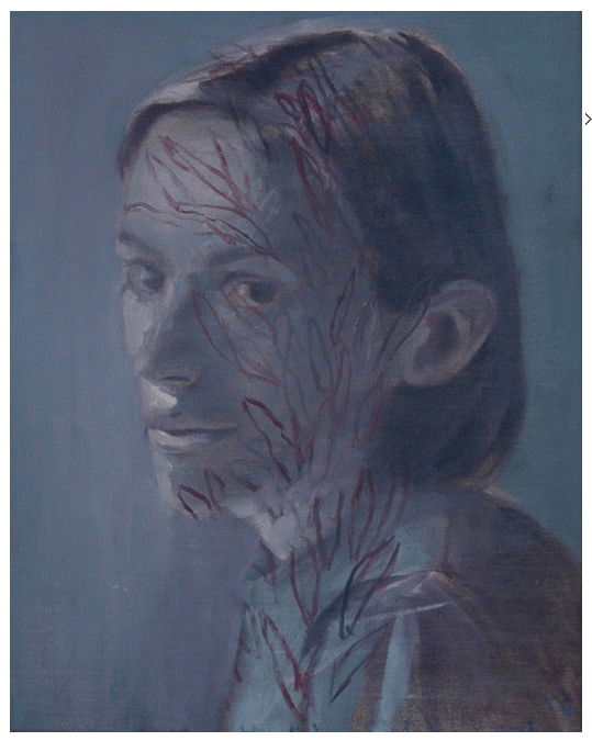
Fig. 4. Tinei, A My Sister (2009) 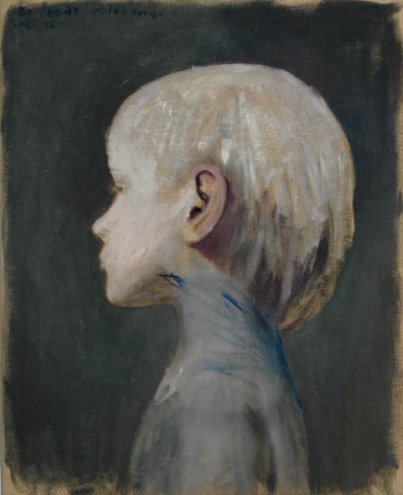
Fig. 5. Tinei, A My Body Rules Me (2010) 
Fig. 6. Tinei, A Warhol (2017)
Again, looking briefly at Tinei’s works, I am completely in awe of the work and the skill required to have completed them. I am very intrigued by Tinei’s ability to work from darkest to lightest and to use the ground within the actual image. The latest piece bears hardly any detail added by the artist, however, the image is very clear and believable. This really reminds me of my earlier research in respect of positive and negative space and the power this holds in the art world. I can see within these pieces my tutor’s suggestion that I should use limited palettes and subdued colours as the effect is just so powerful considering the ‘dullness’ used to create it. I really like how the subjects have been made to appear as though zombies, specifically the image of the child as they are very sinister and really appealing to me. I think the subdued colours used really add to this terror and excitement. I thoroughly like the idea of trying to recreate this idea myself. I think this could tie in rather nicely with my passion for the human figure and also trees, as the veins could easily be viewed in a similar way to the roots of trees and plants which are, in essence, also veins.
Adrian Ghenie
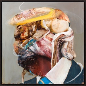
Fig.7. Ghenie, A Untitled (2019) 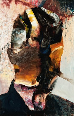
Fig. 8. Ghenie, A Self-Portrait (2017) 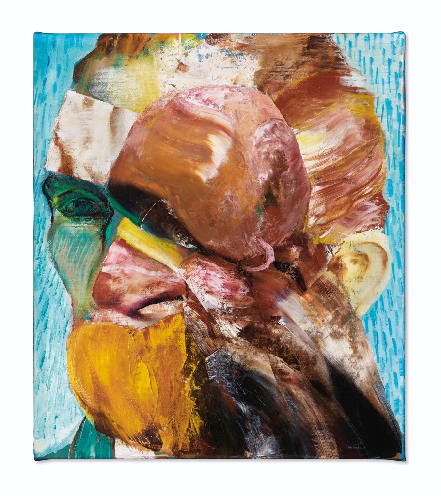
Fig. 9. Ghenie, A The Lidless Eye (2017)
This artist is completely different to any of the others I have previously researched! From these pieces, I can understand my tutor’s comments relating to not needing to concern myself with trying to produce tight outlines and allowing them to develop naturally. Whilst the pieces appear to be collages of paint in quite a random way, it is still very clear who the subjects are (except for the self-portrait as I do not really know the person behind the paint, however, I feel if I did know the subject, it would still be very clear and easy to relate to). The way the paint has been applied really reminds me of food for some reason, which I find rather peculiar as there is no indication of this when you actually look at the paint closely. It reminds me of the consumerism of Pop Art pieces and I wonder whether this artist is trying to incorporate a similar sort of message here somehow? Whilst I fully appreciate the bizarre beauty within these pieces, I do not feel this to be my ‘way’ of working at all, however, I will definitely take the way in which paint can be applied so boisterously and intensely without much care for the result forwards with me in my future work.
Christopher Orr
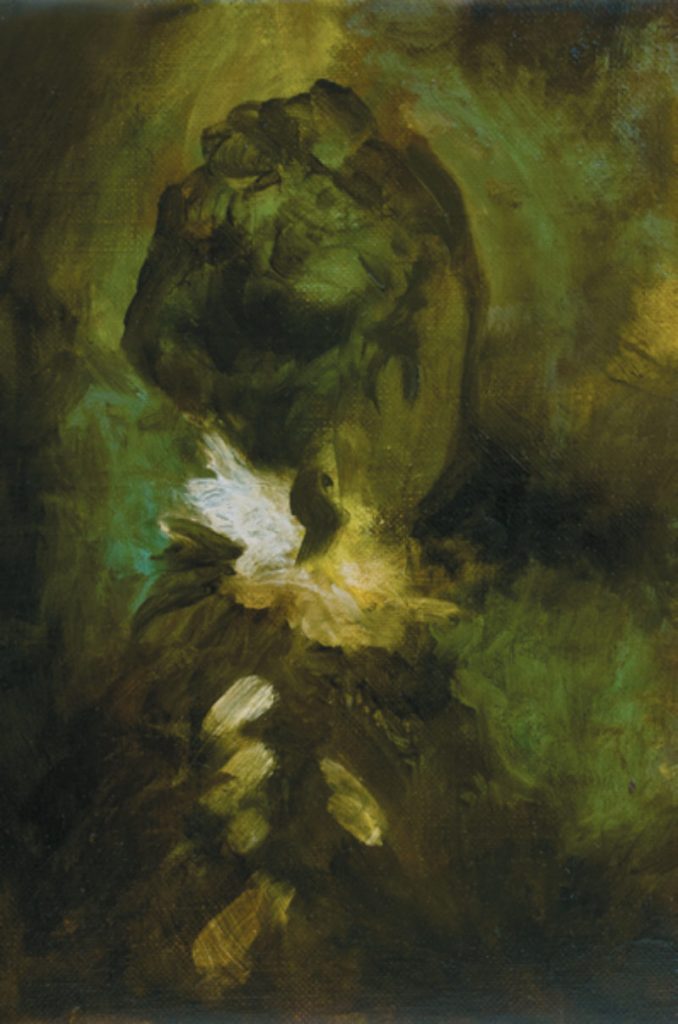
Fig. 10. Orr, C Time we Left this World Today (2009) 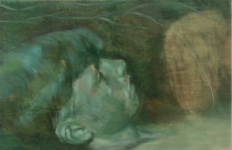
Fig. 11. Orr, C Untitled (2018) 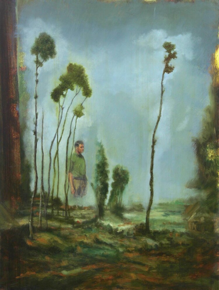
Fig. 12. Orr, C. Nature Yet Remembers (2019)
These pieces are utterly beautiful to me. I love the darker tones and deeper atmospheres within the pieces. The brushwork is also breathtaking to behold. I really like how the figures appear almost ethereal, appearing from within the page. These works really clarify for me my enjoyment of darker, moodier works. The latest piece is much brighter and so does not call to me as much. It feels much colder – even though the central image uses rather similar tones and hues, which I find rather intriguing in itself. Why do they speak so differently to me? Blue is a colder colour, so both should feel cold to me, surely? Perhaps it is the overall darker tones in the piece which warm it up somewhat for me? This murky, muddy way of working really is far more intriguing to me than delicate, ‘pretty’ colour pieces, so I will definitely try to include these types of palettes within my own work.
Michael Borremans
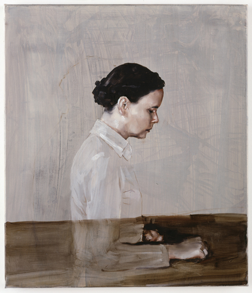
Fig. 13. Borremans, M One (2003) 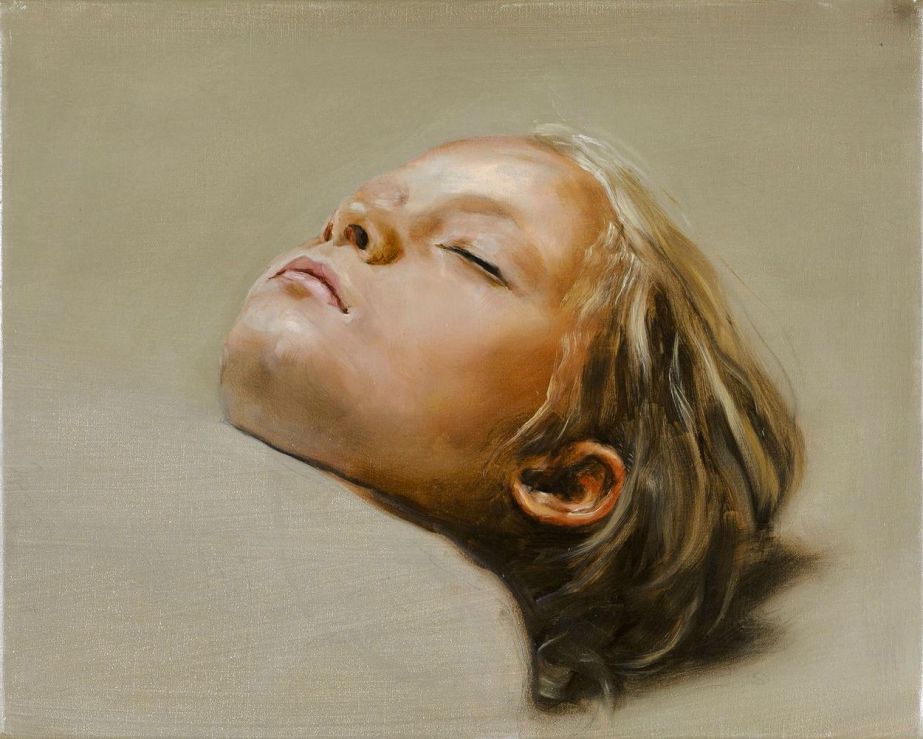
Fig. 14. Borremans, M Sleeper (2007) 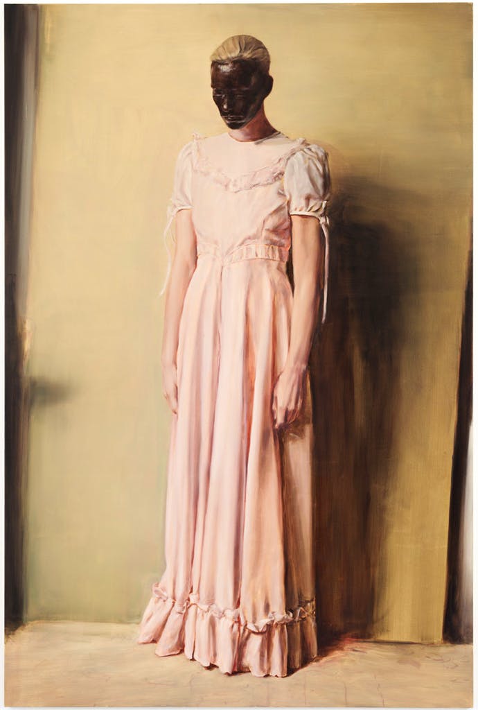
Fig. 15. Borremans, M The Angel (2013)
From all of the pieces viewed, I find these pieces to be the most sinister in a much different way from the others. The fact the artist has used a very delicate and ‘pretty’ palette, as well as a gentle and controlled application of the paint is rather contrary to the messages portrayed within the pieces. The woman in the first piece is ethereal, with us being able view through her torso as she faces away from us. The second of the child is rathwer disturbing. Whilst it is titled ‘Sleeper’, I cannot help but imagine what I do not want to even consider, that this beautiful, angelic child is actually just a corpse, which is extremely disturbing, but also really grasping. The third is utterly bizarre. The lady in the image is dressed in a very pretty manner and, again, could be viewed as angelic and innocent, but then her face – which is the thing which draws you in in the first place due to it being the only darkness in the piece (the opposite I think would also ring true, should the colours be inverted) – is very disturbing and unnerving to behold. I am taken, for some reason, to the wartime and feel as though this ‘angel’ could be watching over me during an air-raid perhaps. Whilst I said above that I prefer the darker, murkier works to produce the sinister, I cannot help but admire this method as the artist works in a delicate and pretty way, which generally does not appeal to me, but the results are very disturbing for the viewer, which then draws my interest and intrigue back in. Perhaps this is something I could consider going forward as well, instead of just shutting myself off to one method solely to create a darker atmosphere within my pieces? Perhaps dark doesn’t have to be so dark after all.
Justin Mortimer
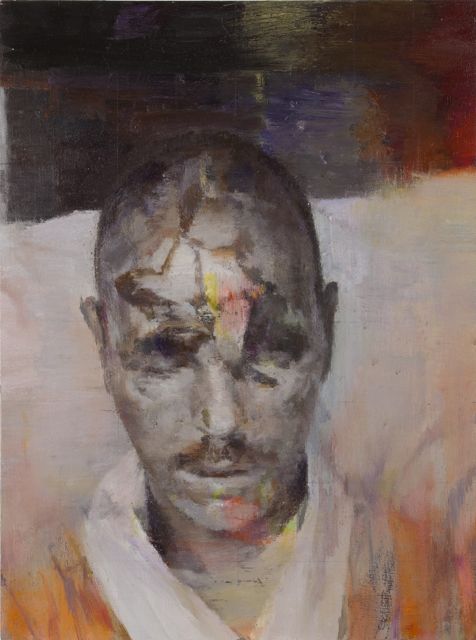
Fig. 16. Mortimer, J Hex (2012) 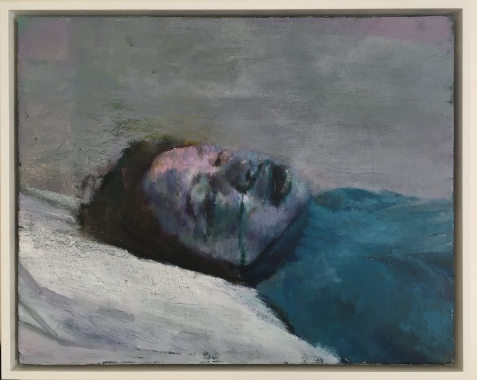
Fig. 17. Mortimer, J Donor VI (2014) 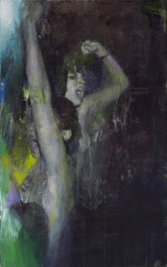
Fig. 18. Mortimer, J Pilgrims (2015)
These pieces are so rich and deep in their use of tones and hues. The third piece in particular is utterly mesmerising and captivating. I read that the artist uses images from pornography, when subjects were at the height of their passion, but choosing to interpret this as though in a state of torture or as though a zombie again, as opposed to ecstasy. I think this utterly genius and extremely intriguing. The fact the two extreme emotions can be so easily confused, purely by attaching different colours – in this case colder hues as opposed to the warmer hues imagined when thinking of the erotic – is fantastical in itself. Looking at the third piece, whilst this is my favourite of the three, I think this transformation has been a little less successful as it is rather apparent that the subjects are partying. This is unless the whole intention of the artist in this piece was to show the sin of act itself is disturbing enough on its own perhaps?
Luc Tuymans: Use of Tone and Other Aspects of Practice
Fig. 19. Tuymans, L Gas Chamber (1986) 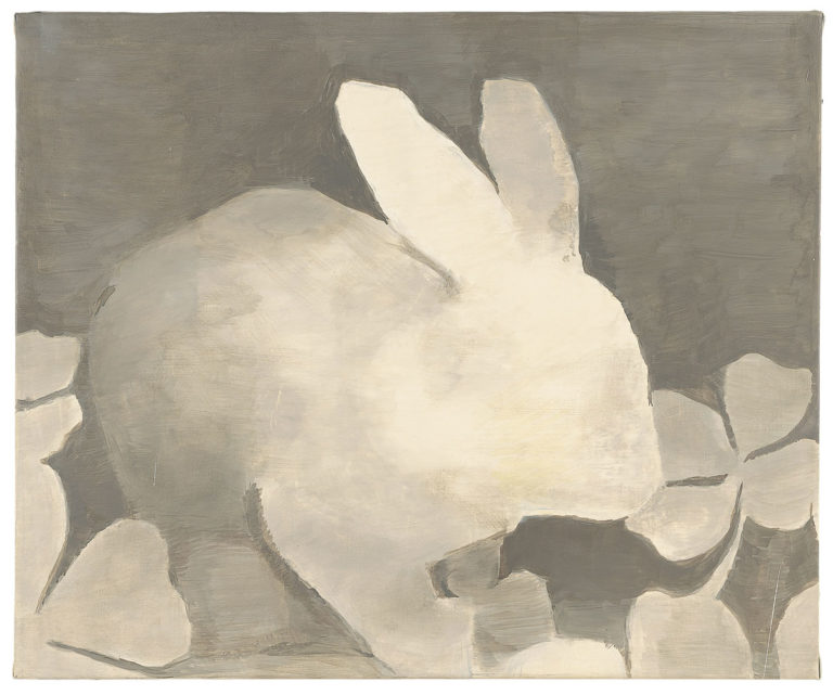
Fig. 20. Tuymans, L The Rabbit (1994) 
Fig. 21. Tuymans, L John Playfair (2014)
As with the other artists suggested to me, I fully appreciate this artist’s use of limited palettes and the effects to be achieved with only a very limited palette. The contrasts between the hues is beautiful. The chamber and rabbit in particular help me to appreciate my tutor’s comments regarding subtler changes in tonal ranges. Considering how little detail there is within the pieces, the depth created is fantastic. This really imbues the fact that it is not so much how much paint is applied. bit more the preciseness of how it is applied.
Suggested Reading
Notes on a Painter by Henri Matisse
Reading this article was absolutely fascinating to me and I feel I have a much better understanding of who Matisse was as a person, as well as an artist.
I am intrigued to note that Matisse readily accepted that his opinion and preferences were ever evolving and the ways in which he had worked previously would not necessarily be how he would have worked in whatever present time he found himself in, having changed with age and time, though he did believe that he, like all artists, was limited to his own time in history.
Matisse was almost obsessed with obtaining expression in all his works, but in every single aspect of them, including the subject, the composition, the colour and the brushstrokes. He would create his pieces over several sittings as he felt the expression he may have applied in his first sitting may no longer be relevant or as strong. For example, the colours in subsequent sittings may actually be more subdued than vibrant, as previously applied. He aimed to search for the deeper meaning behind what he saw instead of accepting the fleeting moment expressed by the Impressionists. He also aimed to create harmony within his pieces, ensuring the colours and brushstrokes all worked with this aim in mind, working in an instinctual way, preferring this to the traditional way in which rules were applied to pieces and scientific approaches. Matisse chose to instil colour in a way in which emotion and meaning told him he should. He felt these rules could only really be applied when trying to create pieces to mimic or replicate that of the Old Masters or even other works by artists through other movements, so he did not let this hold him back from doing what he felt was right for him.
Matisse’s earlier works were created with a more passionate approach but as he aged, he tried to instil a sense of tranquillity and serenity within his pieces so they would always appeal to him as the more passionate pieces would cause him unrest if viewed when he was not in the same mind-frame as that of the time of creation.
Matisse was also eager to create a sense of differentiation between his canvases as he felt those of the Impressionists were too similar in appearance and achievement.
I really appreciate Matisse’s methods and beliefs with regard to harmony and instinct. I confess that thus far I have fully enjoyed learning the ‘rules’ and theories relating to colour, but I do much prefer to work rather immediately and instinctively. Perhaps I should take Matisse’s stance into consideration and my tutor’s comments regarding having more belief in my own work, moving forward.
Cezanne’s Doubt by Maurice Merleau-Ponty
Whilst I did not find this article quite as interesting as the Matisse one (perhaps due to it not being firsthand?), having read this piece, I was intrigued to learn that Cezanne was rather reclusive, neurotic and pessimistic in his personal life as well as within his earlier works, in which he would produce seedier subjects and passionate brushstrokes. Cezanne’s later works showed his yearning for a more harmonious result, having found a passion for the beauty of nature, by using a gentler subject matter and brushstrokes.
Cezanne’s opinion of his work was that it was never quite good enough and that he could not recreate the world perfectly due to not being at the level to be able to do so wholly, such as that of a god.
Cezanne did not follow the ‘rules’ of tradition, but rather chose to work instinctively instead, allowing his medical problem with his eyes to show him his way in his pieces. He allowed the art to consume him and it was his entire life. He literally shut himself off from the rest of the world to be able to concentrate on the one thing he was passionate about, turning his back on humanity.
Having read this article, I feel I definitely have a better understanding and appreciation for Cezanne’s work now than when I have previously carried out research of his pieces. Where I saw just different colours and combinations, as well as a ‘less than perfect’ technique, I can actually now see the beauty and intelligence which has actually gone into all of his pieces, all of which I feel I can appreciate with better clarity due to having a better understanding of the mentality of the man behind the paint. This definitely leads back to my tutor’s comments regarding the types of questions I should be considering of the artists and their works when researching them.
Pointers for the Next Assignment
Having considered my tutor’s feedback, I fully agree with the suggestions provided and will endeavour to include them within my future pieces, such as using more earth tones and monochromatic paintings, transitions of tone and economical creations. I will also bear in mind the questions to consider when carrying out my research.
List of Illustrations
Fig.1. Martin, A (1959) ‘Untitled’ [Painting] At: (Accessed on 14 March 2020)
Fig.2. Martin, A (1998) ‘Untitled’ [Painting] At: https://www.theguardian.com/artanddesign/2015/may/22/agnes-martin-the-artist-mystic-who-disappeared-into-the-desert#img-2 (Accessed on 14 March 2020)
Fig.3. Martin, A (1999) ‘Innocent Love’ [Painting] At: (Accessed on 14 March 2020)
Fig.4. Tinei, A (2009) ‘My Sister’ [Oil on canvas] At: http://vogesundpartner.com/artists/alexander-tinei/5/ (Accessed on 27 March 2020)
Fig.5. Tinei, A (2010) ‘My Body Rules Me’ [Oil on Canvas] At: http://ilikepaints.blogspot.com/2012/04/alexander-tinei.html (Accessed on 27 March 2020)
Fig.6. Tinei, A (2017) ‘Warhol’ [Oil on canvas] At: http://www.deakerikagaleria.hu/index.php/en/muveszek/item/85-alexander-tinei (Accessed on 27 March 2020)
Fig.7. Ghenie, A (2019) ‘Untitled’ [Oil on Canvas] At: https://ocula.com/artists/adrian-ghenie/ (Accessed on March 2020)
Fig.8. Ghenie, A (2017) ‘Self-Portrait’ [2017] At: https://ocula.com/artists/adrian-ghenie/artworks/(Accessed on March 2020)
Fig. 9. Ghenie, A (2017) ‘The Lidless Eye’ [Oil on canvas] At: https://www.christies.com/lotfinder/Lot/adrian-ghenie-b-1977-the-lidless-eye-6236031-details.aspx (Accessed on 27 March 2020)
Fig. 10. Orr, C (2009) ‘Time we Left this World Today’ [Oil on linen] At: https://mapmagazine.co.uk/christopher-orr (Accessed on 27 March 2020)
Fig. 11. Orr, C (2018) ‘Untitled’ [Oil on linen] At: https://www.artlaborie.com/artists/orr/#jp-carousel-3019 (Accessed on 27 March 2020)
Fig. 12. Orr, C. (2019) ‘Nature Yet Remembers’ [Oil on wood panel] At: https://www.christopherorr.co.uk/artist-christopher-orr (Accessed on 27 March 2020)
Fig.13. Borremans, M (2003) ‘One’ [Oil on canvas] At: https://litera.hu/irodalom/netnaplo/almodo_szellem.html (Accessed on 27 March 2020)
Fig. 14. Borremans, M (2007) ‘Sleeper’ [Unknown] At: https://curiator.com/art/michael-borremans/sleeper (Accessed on 27 March 2020)
Fig. 15. Borremans, M (2013) ‘The Angel’ [Unknown] At: https://www.apollo-magazine.com/the-modern-mysteries-of-michael-borremans/ (Accessed on 27 March 2020)
Fig. 16. Mortimer, J (2012) ‘Hex’ [Unknown] At: https://www.guernicamag.com/justin-mortimer-contorted-view/ (Accessed on 31 March 2020)
Fig. 17. Mortimer, J (2014) ‘Donor VI’ [Oil on canvas] At: http://homeat735.com.au/uk-artist-justin-mortimer-exhibiting-at-home/ (Accessed on 31 March 2020)
Fig. 18. Mortimer, J (2015) ‘Pilgrims’ [Oil on canvas] At: https://www.artsy.net/artwork/justin-mortimer-pilgrims (Accessed on 31 March 2020)
Fig. 19. Tuymans, L (1986) ‘Gas Chamber’ [Unknown] At: https://www.independent.co.uk/arts-entertainment/art/great-works/great-works-gas-chamber-1986-by-luc-tuymans-8515230.html (Accessed on 1 April 2020)
Fig. 20. Tuymans, L (1994) ‘The Rabbit’ [Oil on canvas] At: https://www.palazzograssi.it/it/mostre/passate/luc-tuymans-la-pelle/the-rabbit-1994/ (Accessed on 1 April 2020)
Fig. 21. Tuymans, L (2014) ‘John Playfair’ [Oil on canvas] At: https://www.tate.org.uk/tate-etc/issue-35-autumn-2015/luc-tuymans-on-henry-raeburn (Accessed on 1 April 2020)
Bibliography
Apollo. (2016) ‘The Modern Mysteries of Michael Borremans’ [Online] At: https://www.apollo-magazine.com/the-modern-mysteries-of-michael-borremans/ (Accessed on 27 March 2020)
Art in World. (Unknown) ‘At Palazzo Grassi Luc Tuymans’s First Solo Show in Italy’ [Online] At: https://www.arteinworld.com/en/at-palazzo-grassi-luc-tuymanss-first-solo-show-in-italy/?cn-reloaded=1 (Accessed on 1 April 2020)
Deak Erika Galeria (Unknown). ‘Alexander Tinei’ [Online] At: http://www.deakerikagaleria.hu/index.php/en/muveszek/item/85-alexander-tinei (Accessed on 27 March 2020)
Guernica. (2013) ‘Justin Mortimer: Contorted View’ [Online] At: https://www.guernicamag.com/justin-mortimer-contorted-view/ (Accessed on 27 March 2020)
Hashtag Legend. (2016) ‘Michael Borremans and the Artistry of Unease’ [Online] At: https://hashtaglegend.com/culture/michael-borremans-art-basel-gallery-museum/ (Accessed on 27 March 2020)
Home @ 735. (Unknown) ‘UK Artist Justin Mortimer Exhibiting at Home’ [Online] At: http://homeat735.com.au/uk-artist-justin-mortimer-exhibiting-at-home/(Accessed on 27 March 2020)
I Like Paints. (2012) ‘Alexander Tinei’ [Online] At: http://ilikepaints.blogspot.com/2012/04/alexander-tinei.html (Accessed on 27 March 2020)
Independent. (2013) ‘Great Works: Gas Chamber (1986) by Luc Tuymans’ [Online] At: https://www.independent.co.uk/arts-entertainment/art/great-works/great-works-gas-chamber-1986-by-luc-tuymans-8515230.html (Accessed on 1 April 2020)
Map Magazine. (2009) ‘Christopher Orr’ [Online] At: https://mapmagazine.co.uk/christopher-orr (Accessed on 27 March 2020)
Matisse, H (1908) Notes of a Painter [PDF] https://www.austincc.edu/noel/writings/matisse%20-%20notes%20of%20a%20painter.pdf (Accessed on 8 April 2020)
Merleau-Ponty, M. (unknown) Cezanne’s Doubt. [PDF] Available at: https://faculty.uml.edu/rinnis/cezannedoubt.pdf (Accessed on 8 April 2020)
Oil Painting with Ethan.com. (Unknown) ‘Should You Oil Paint Dark to Light or the Other Way Around?’ [Online] At: https://oilpaintingwithethan.com/blog/oil-painting-tips/oil-painting-dark-to-light/ (Accessed on 5 April 2020)
Pace Gallery. (Unknown) ‘Adrian Ghenie’ [Online] At: https://www.pacegallery.com/artists/adrian-ghenie/ (Accessed on 1 April 2020)
The Guardian. ‘Agnes Martin, The Artist Mystic Who Disappeared into the Desert’ [Online] At: https://www.theguardian.com/artanddesign/2015/may/22/agnes-martin-the-artist-mystic-who-disappeared-into-the-desert (Accessed on 27 March 2020)
The Paris View. ‘On Line: The Pulse of Agnes Martin’ [Onine] At: https://www.theparisreview.org/blog/2019/09/19/on-line-the-pulse-of-agnes-martin/ (Accessed on 27 March 2020)

5 thoughts on “Part One: Comments on Tutor Feedback and Artist Recommendation Research”